

Brand Identity · Web Design
Basic Capital is rethinking how Americans build long-term wealth through retirement. Their platform introduces a new model for 401(k) growth, giving employees access to capital that can help them participate more meaningfully in wealth creation over time.
Feely Studio partnered with Basic Capital to build a brand identity and digital presence for a financial product that needed to feel both ambitious and trustworthy: bold enough to signal a new category, clear enough to make a complex idea feel understandable.
How do you brand a financial product that asks people to reconsider one of the most familiar systems in American life: the 401(k)?
Basic Capital was entering a space where trust is non-negotiable. The idea was ambitious, but the brand could not feel speculative, overly technical, or inaccessible. It needed to make a complex financial mechanism feel clear, credible, and human, while still carrying the confidence of a company building something genuinely new.
The challenge was to create a brand that could speak to multiple audiences at once: employees thinking about their future, employers evaluating a new benefit, investors assessing a category-defining opportunity, and partners looking for institutional seriousness.


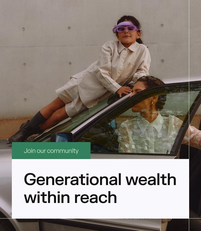
The central idea became access: making wealth-building feel less like a privilege and more like a system people can actually participate in.
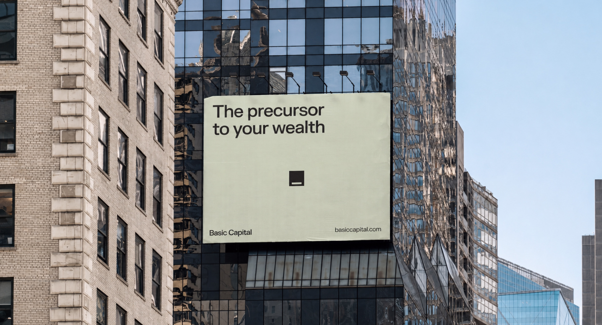
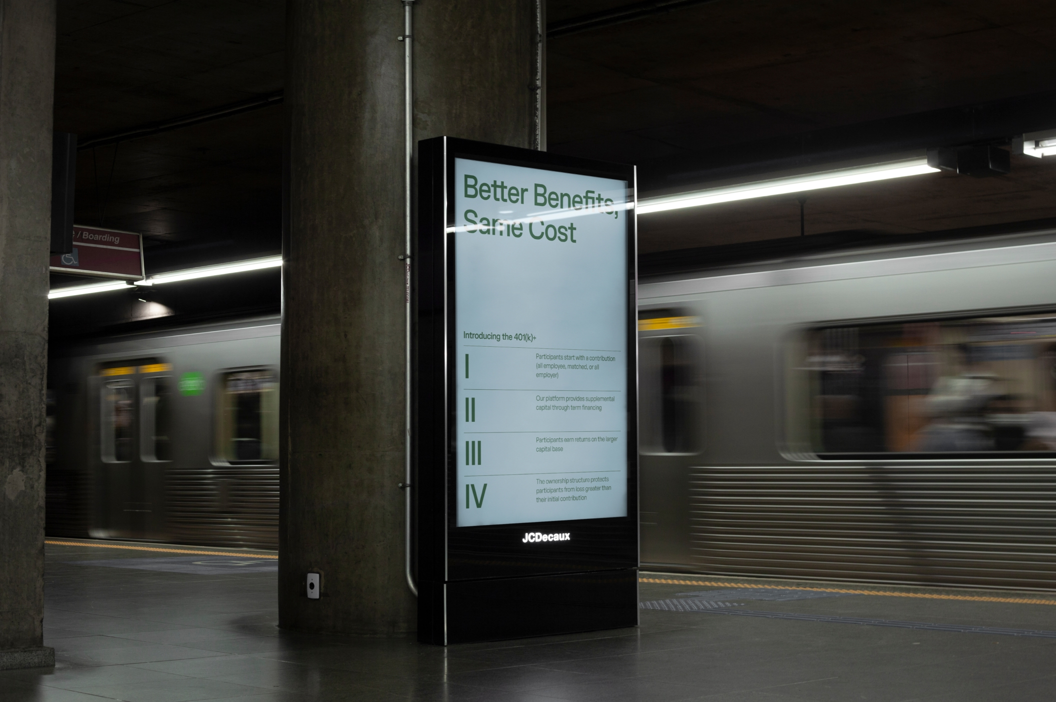
Rather than presenting Basic Capital as another fintech tool, we framed the brand around momentum, ownership, and the first step toward long-term financial agency. The identity needed to translate a sophisticated financial concept into something direct, optimistic, and structurally clear.
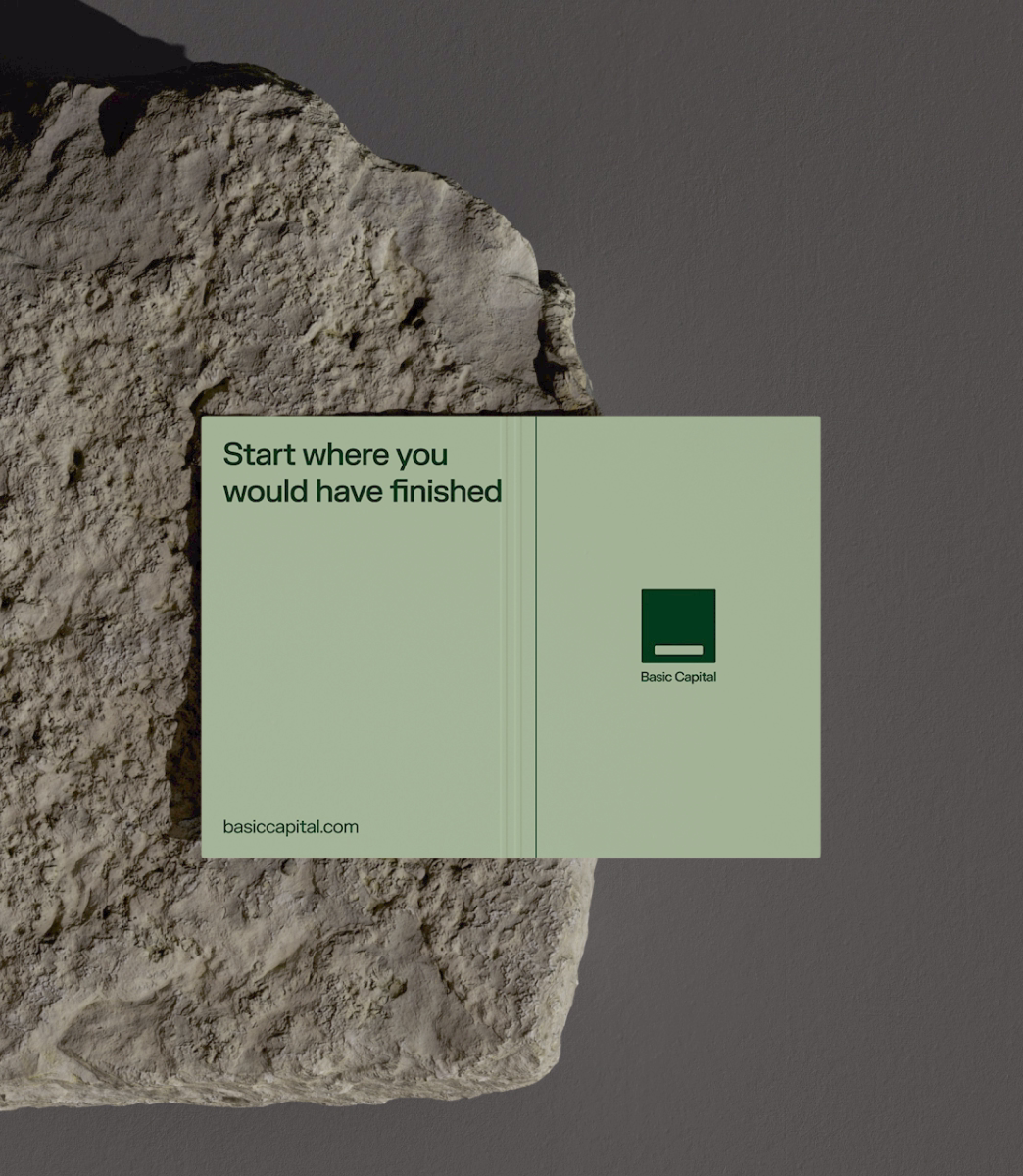
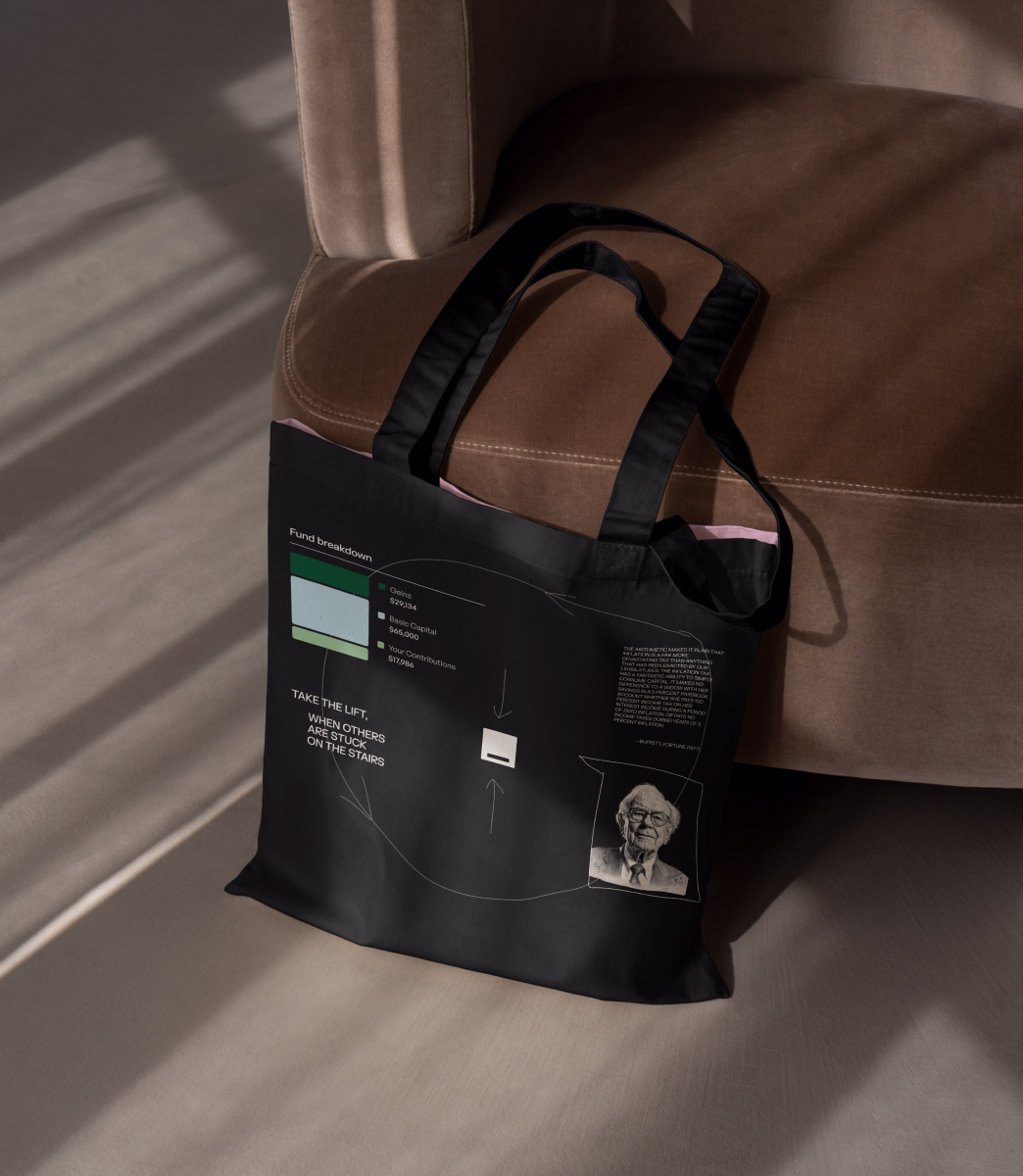
The cursor became a simple metaphor for action. It represents the moment before something begins: a first click, a first contribution, a first decision to start building.
For Basic Capital, this symbol helped express a core belief: people should not need significant existing wealth to begin participating in wealth creation. The cursor turns that idea into a visual language of immediacy and agency. It says: start here.

The visual system is built around structure, growth, and accumulation. Modular blocks, precise layouts, and upward movement create a sense of progress without relying on generic financial imagery.
Each element works as a metaphor for long-term wealth-building: small units compounding into something larger, individual decisions becoming a system, and financial growth becoming easier to understand through form, rhythm, and hierarchy.
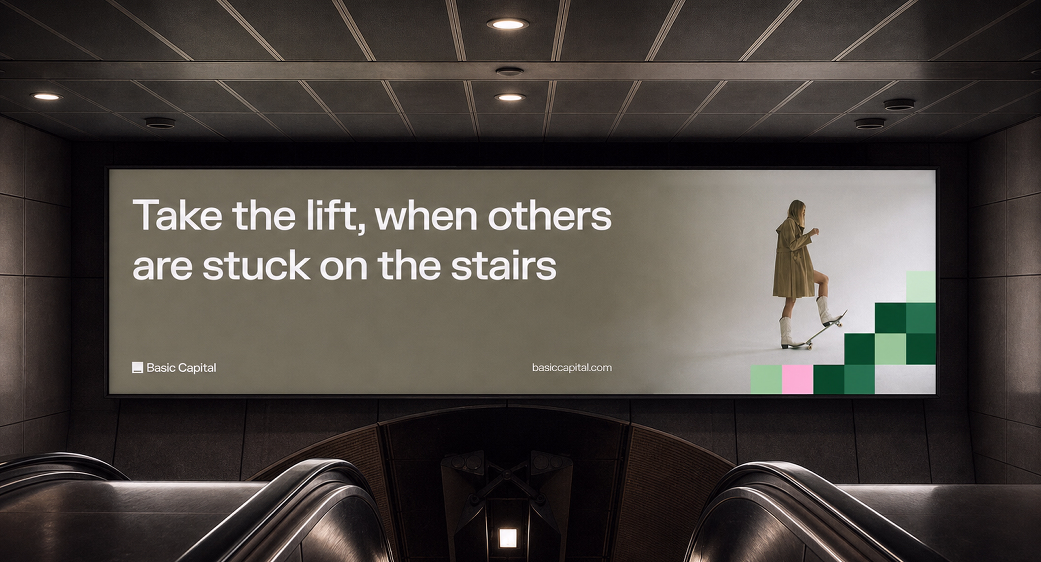
The pattern system extends the idea of accumulation. Repeating blocks create visual momentum, suggesting growth that is built step by step rather than achieved all at once.
Used across brand applications, the patterns give Basic Capital a recognizable graphic language that feels both systematic and optimistic: structured enough for finance, expressive enough for a consumer-facing brand.
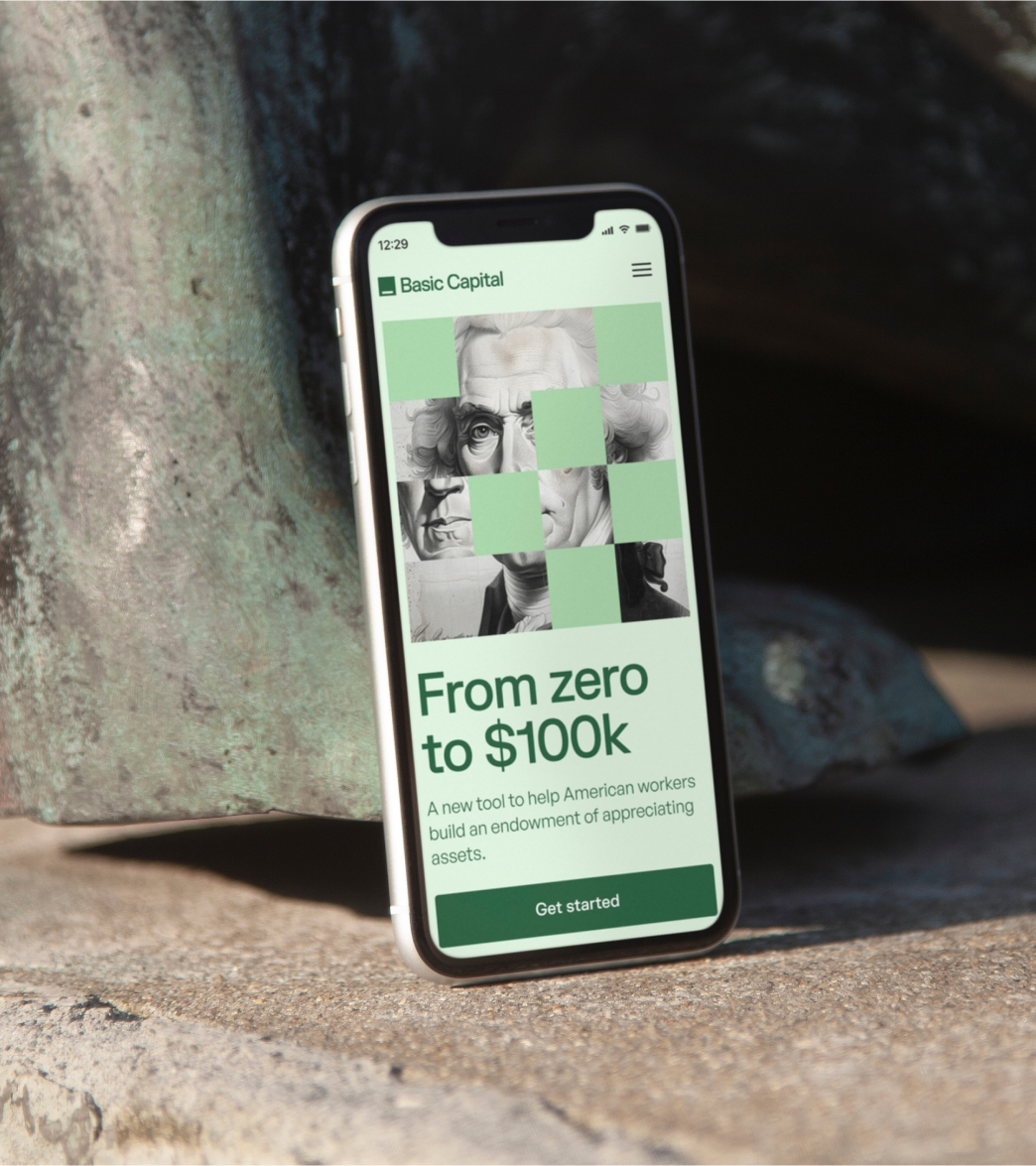
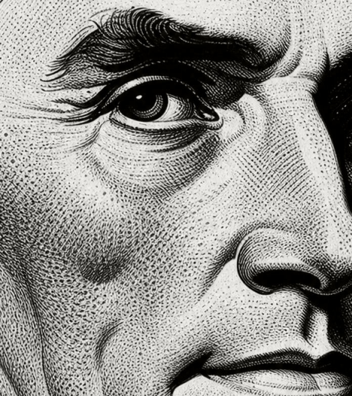
The illustration system brings a broader cultural and historical layer into the brand. By referencing figures associated with progress, capital, and systems of change, the identity connects Basic Capital’s mission to a larger story about access, ownership, and economic participation.
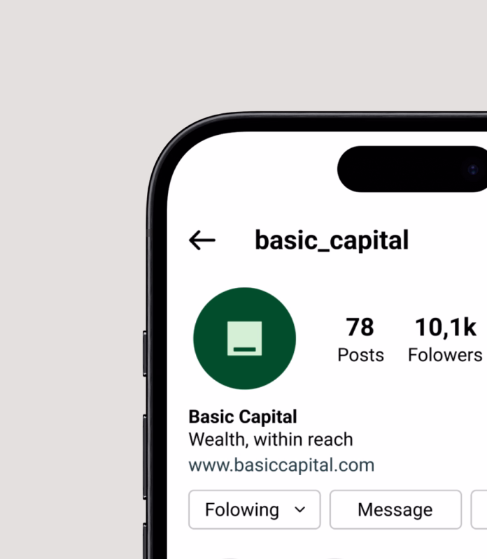
We developed a flexible brand system across presentation decks, social media, document templates, posters, merchandise, and investor-facing materials.

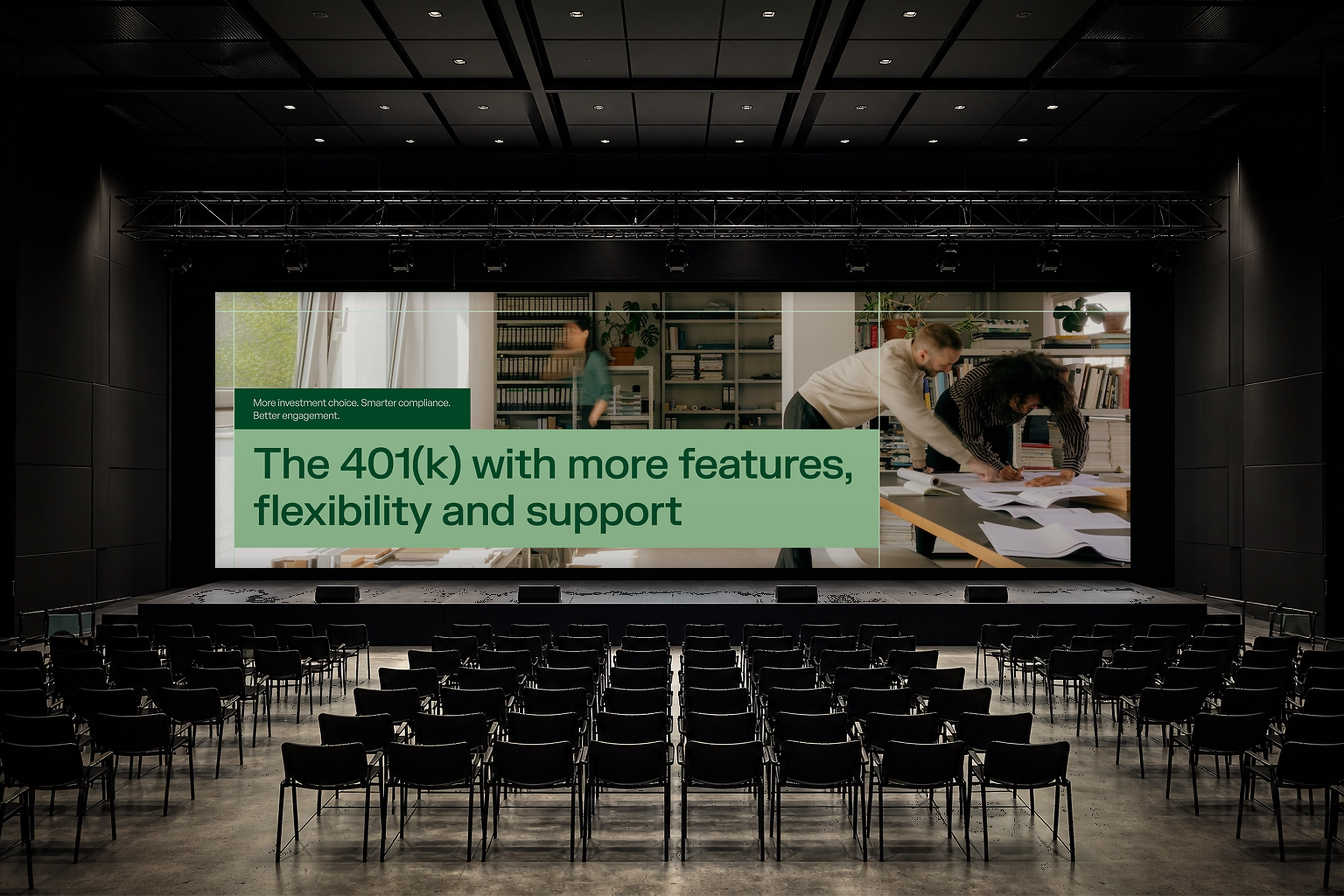
The presentation system included 101 slide layouts for storytelling, data, photography, charts, and product explanations.
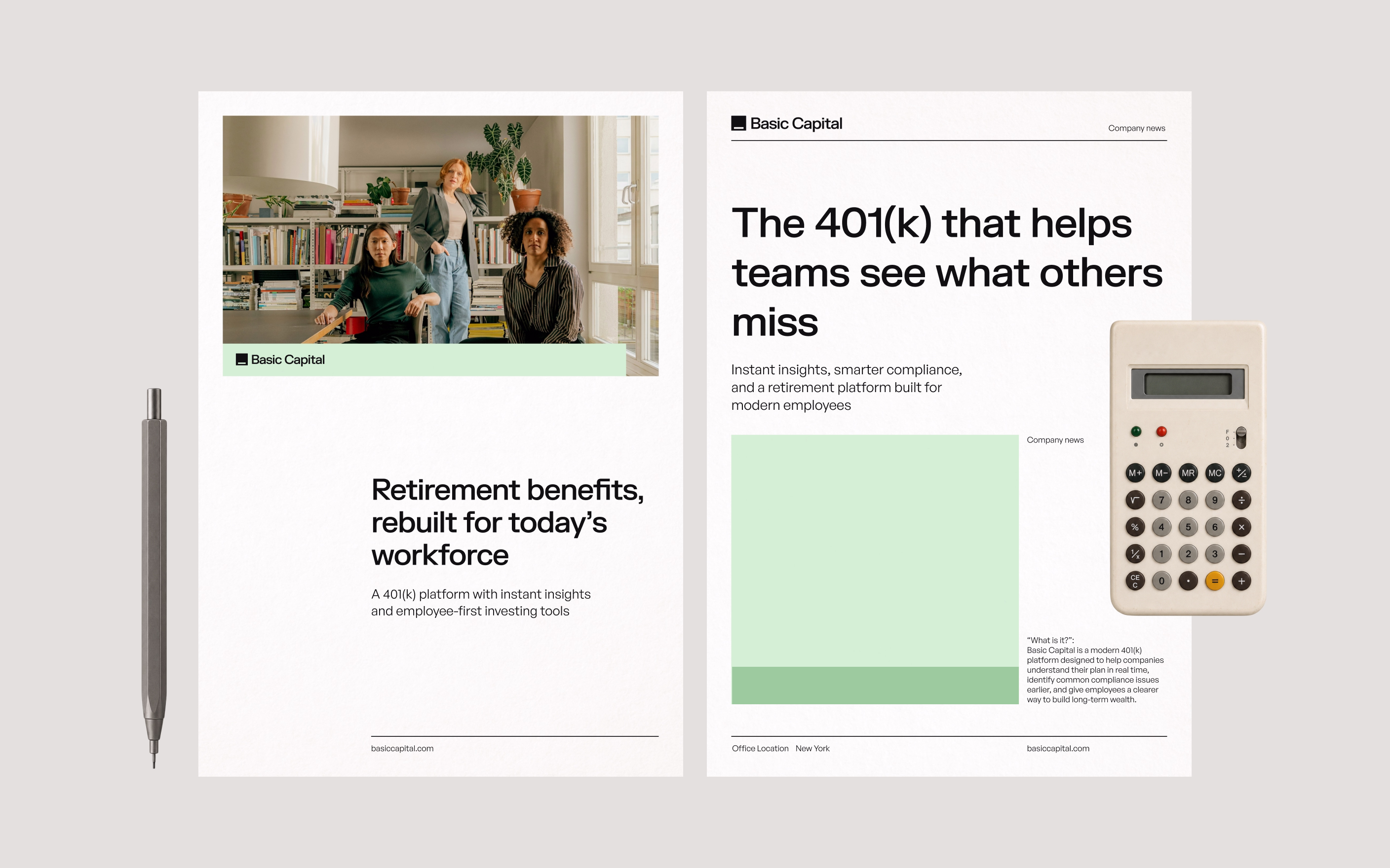
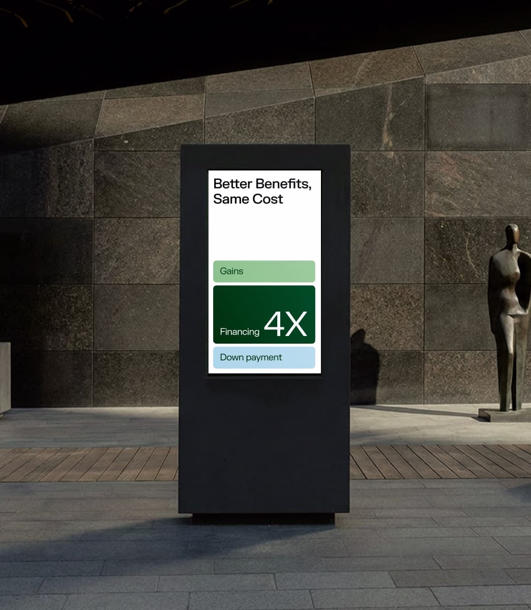
Financial communication often becomes dense, technical, and hard to navigate. We designed an editorial system that makes Basic Capital’s materials feel clear, readable, and considered.

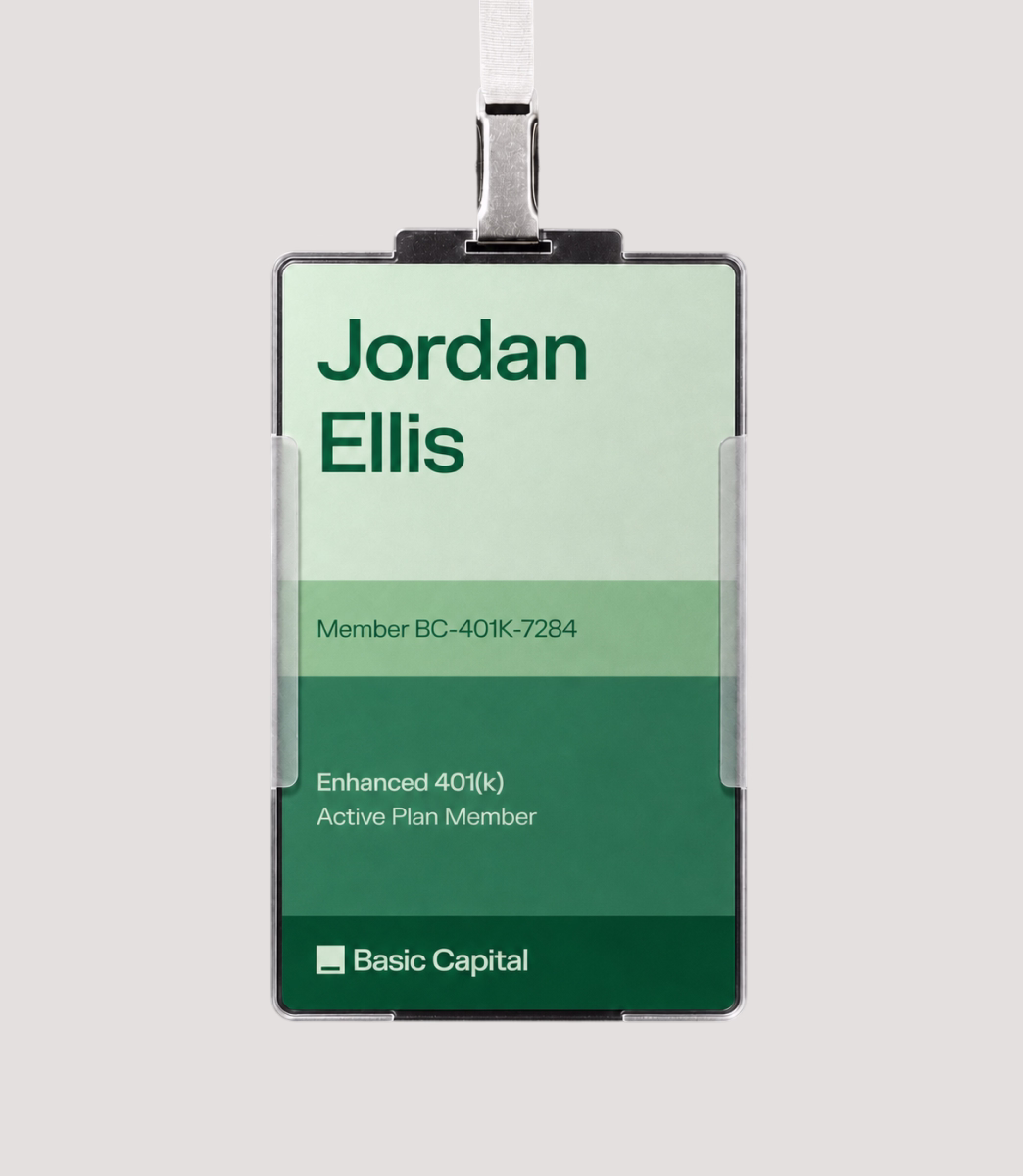
We considered how the brand would live beyond the screen, from printed materials to merchandise and real-world touchpoints.
These applications helped test the identity as a complete system: not just a website or a deck, but a brand with enough range to appear in investor meetings, employee benefit conversations, public campaigns, and everyday moments.

In August 2025, Basic Capital announced a $25M Series A led by Forerunner and Lux Capital, roughly a year and a half after the rebrand.
For a company building in a complex and highly scrutinized category, the raise marked an important step forward: Basic Capital had moved from an ambitious idea into a more visible market conversation about the future of 401(k)s, private capital, and long-term wealth access.
Design: Tatiana Leonteva
Brand copywriter: Amelie Pollak
Art direction: Anastasia Sycheva
Abdul Al-Asaad
CEO, Basic Capital
The team was incredible empathetic to our needs, constraints, and preference and thoughtfully executed accordingly on every detail. Product management communication was extremely clear, we knew what they were doing every day and what was the deliverable every week. Full Review
Southleap built a brand that reframes post-sales hiring as a growth advantage
Enduvo rebranded to lead a new category in immersive, no-code learning

Bloxspring rebranded to grow from PR shop to global content partner
Aimme showed up bold in B2C HR where bad design kills

Lancer built a brand that signals trust, precision and scale for enterprise clients

Noxus turned vision into $1.5M pre-seed three months after rebrand

Glozo launched bold to get seen by talent and clients in a noisy HR market

Reshaping Cloud Marketplace Procurement
Branding and website for a Swiss web 3.0 startup to bring a new product to market

Design support for Scade, a no-code AI platform for building multi-modal agents

Visual identity and website design for a healthcare data management company

Redesign project for a healthtech startup

Redesign project for a data startup

Redesign project for a Fintech startup
