

Brand Identity · Web Design · Web Development
Acurast connects developers to real-world data providers via its marketplace on the Acurast blockchain, enabling access to data within their blockchain applications.

The intro section gives instant insight into what the company is doing. The lines on the black background simultaneously refer to data transferring and the metaphor of the universe — the lines resemble the rings of Saturn.


The main symbol of the concept is a portal. Acurast transfers data from the real world to blockchain applications through the portal. During the transition, the data's transformation is visualized through changes in color and gradient.

The metaphor of the portal is evident throughout the graphic — this allows the brand to be recognized even without a logo.


The simple but expressive organization of space is maintained even on small screens. Because it is simple.

The use of 3D expands the visual vocabulary of the brand and therefore helps generate interest.

Brand graphics uses simple vector forms, so you can quickly create a new one.


Inner pages are consistent, but use color coding and other techniques to engage and create a sense of context.

We established short guidelines for using visual graphics and created a visual system for brand communication.
Design: Tim Lebedev
Development: Tim Lebedev, Miusov Dmytro
Art direction: Anastasia Sycheva
Enduvo rebranded to lead a new category in immersive, no-code learning
Bloxspring rebranded to grow from PR shop to global content partner

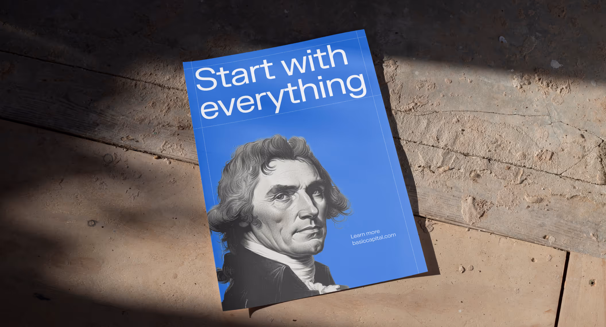
Basic Capital built a trusted brand from day one because in fintech, trust isn’t optional
Aimme showed up bold in B2C HR where bad design kills

Lancer built a brand that signals trust, precision and scale for enterprise clients

Noxus turned vision into $1.5M pre-seed three months after rebrand

Glozo launched bold to get seen by talent and clients in a noisy HR market

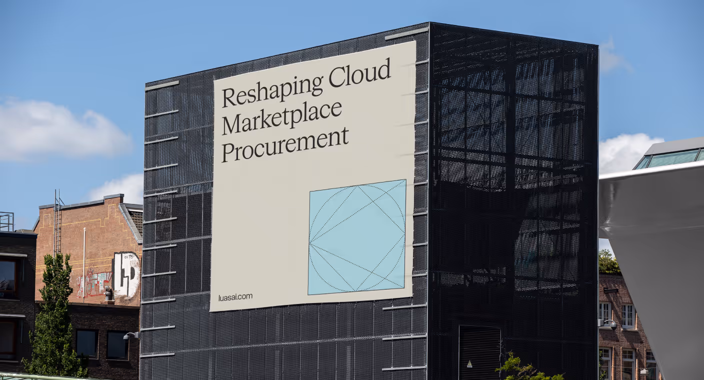
Reshaping Cloud Marketplace Procurement
Design support for Scade, a no-code AI platform for building multi-modal agents

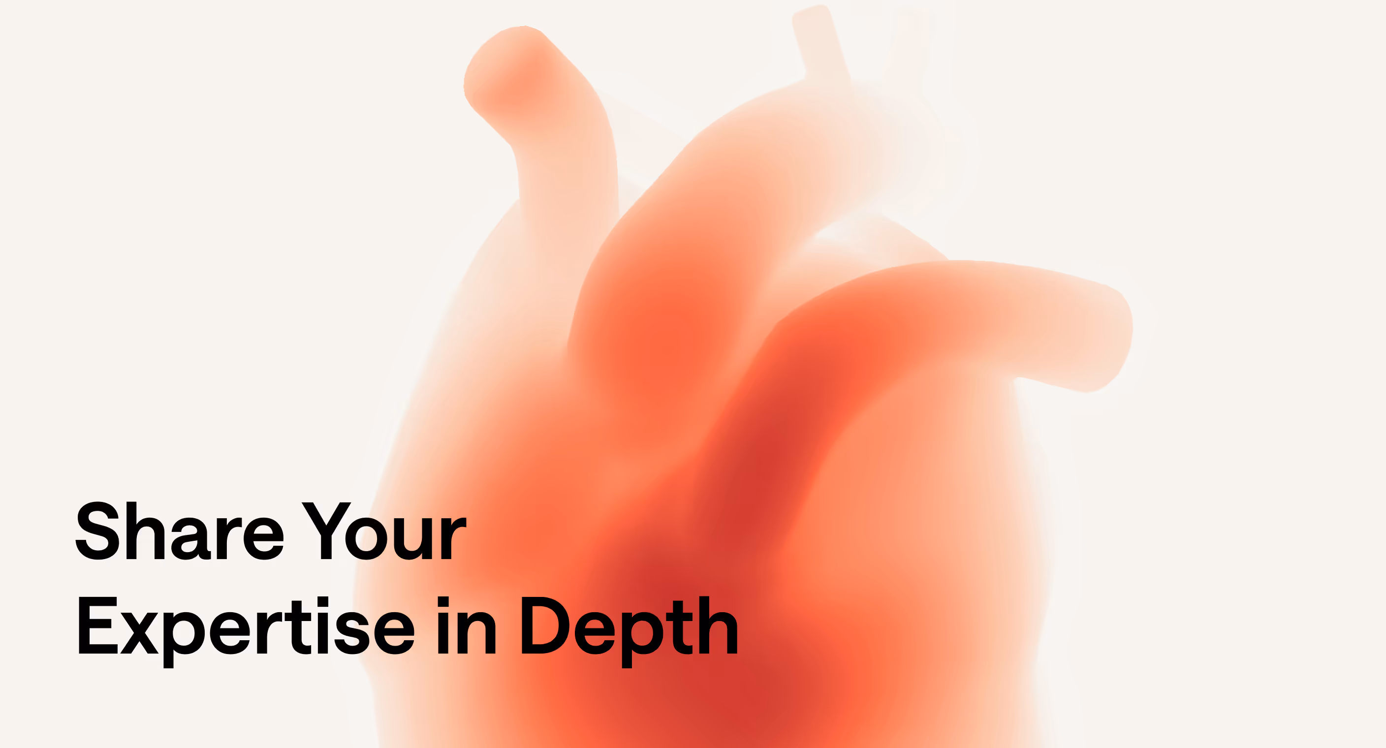
Visual identity and website design for a healthcare data management company

Redesign project for a healthtech startup

Redesign project for a data startup

Redesign project for a Fintech startup
