

Brand Identity · Web Design
Olaris® is revolutionizing how diseases are diagnosed and treated by combining metabolomics and machine learning to develop precision diagnostics for the entire patient journey

Olaris®'s brand identity is built around a modern and forward-thinking approach to precision medicine. The use of chemical formulas in visual graphics, along with the calm and elegant purple color, highlights the company's focus on science, innovation, and sophistication.


The new logo symbolizes three connected molecules that suggest a combination between metabolomics, machine learning, and biology. The customized dot under the letter "i" in the logotype adds a unique touch to the design, emphasizing the attention to detail and customization that Olaris® brings to its precision diagnostics.

Olaris' brand identity is characterized by a combination of chemical formulas and a calm purple color palette. This visual element helps to communicate the company's scientific expertise and dedication to cutting-edge technology.


The calm purple color palette used in Olaris' branding communicates a sense of stability and trustworthiness. This hue is often associated with wisdom, creativity, and innovation, which further reinforces the company's commitment to advancing the field of precision medicine. The use of gradients in the color palette also adds a sense of dynamism and movement, suggesting that Olaris is a company that is always pushing the boundaries of what is possible.


Overall, the brand identity of Olaris® conveys a sense of expertise, innovation, and reliability in the field of precision diagnostics. Through the use of modern design elements and a clear focus on the company's technological strengths, Olaris® stands out as a leader in the field of precision medicine.

Olaris®'s website design features a clean, corporate style that exudes professionalism and inspires trust. The use of a simple and sleek layout, along with a calming color palette, creates a user-friendly and visually appealing experience.

The choice of Courier Prime is based on its association with precision and accuracy, much like computer code. The clean and sharp lines of the font are reminiscent of the structured and exacting nature of programming code. As Olaris®'s focus is on precision diagnostics, the use of Courier Prime reinforces the brand's commitment to accuracy and exactness.
The use of Neue Montreal, on the other hand, adds a modern touch to the brand identity. Its clean and simple design aligns with Olaris®'s clean and corporate style, while also providing a sense of sophistication and elegance.

The style for social media channels is designed to be engaging, informative, and visually appealing. The use of the brand's color palette creates a consistent and recognizable look across all social media channels.
Design: Tatiana Leonteva
Art direction: Anastasia Sycheva
Enduvo rebranded to lead a new category in immersive, no-code learning

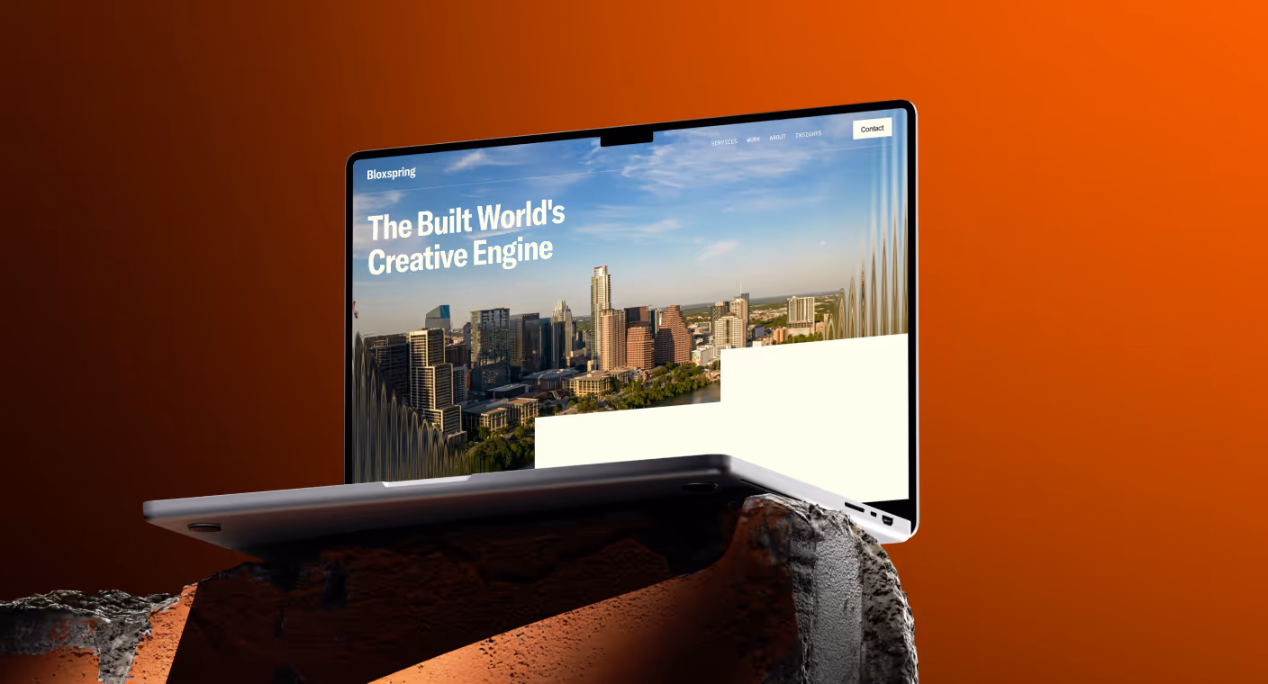
Bloxspring rebranded to grow from PR shop to global content partner
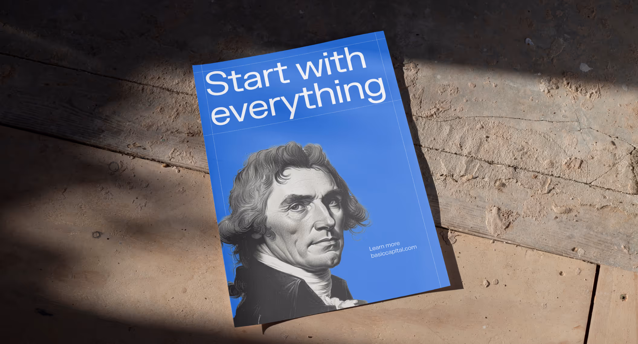
Basic Capital built a trusted brand from day one because in fintech, trust isn’t optional
Aimme showed up bold in B2C HR where bad design kills

Lancer built a brand that signals trust, precision and scale for enterprise clients

Noxus turned vision into $1.5M pre-seed three months after rebrand

Glozo launched bold to get seen by talent and clients in a noisy HR market

Reshaping Cloud Marketplace Procurement

Design support for Scade, a no-code AI platform for building multi-modal agents

Branding and website for a Swiss web 3.0 startup to bring a new product to market

Visual identity and website design for a healthcare data management company

Redesign project for a data startup

Redesign project for a Fintech startup
