April 1, 2025
How SaaS Companies Can Create A Website That Generates Sales
9 minutes
In this article
In the last five years, the market of Software-as-a-Service (SaaS) platforms has tripled. However, it seems that they are all made from the same template and do not differ from each other — neither in positioning, nor in appearance. Because of this, it is difficult for companies to differentiate themselves from competitors and for users to distinguish one service from another.
For example, the start-up Bento recently offered a product for creating a Link in bio. But the company did not stand out against the more prominent competitor — Linktree. As a result, Linktree acquired this quick upstart, as Bento expressed it on Twitter.
At Feely, we have studied 40 SaaS websites from small start-ups to large companies. The result of the experiment revealed the structure of a website that generates sales. In this article, we will use examples to show where and how to place content on the website to stand out from competitors and be remembered by users.
How to Create a SaaS Website with High Conversion
The structure of a SaaS website directly affects its conversion rates. A straightforward, comprehensive format helps users navigate the website and seamlessly guides them through the sales funnel — from the first visit to registration and purchase. On the contrary, getting lost in infinite funnels and cross transitions tires out the person, and they are likely to close the page.
We have prepared two examples of SaaS website structures: one for a main feature product and one for a multiple function product. You can use these structures as a ready-made template for your own SaaS website.

Although the structure is universal, it does not guarantee anything on its own. Factors that can affect its efficiency include:
- A clear and successive navigation menu that allows the user to return to the necessary place at any moment.
- Limitation of choice with cross-links that direct the potential client towards the CTA.
- Unified design that improves user experience.
Next, we will break down the ideal structure of a SaaS website using specific examples, including the main page, prices section, resources, and more.
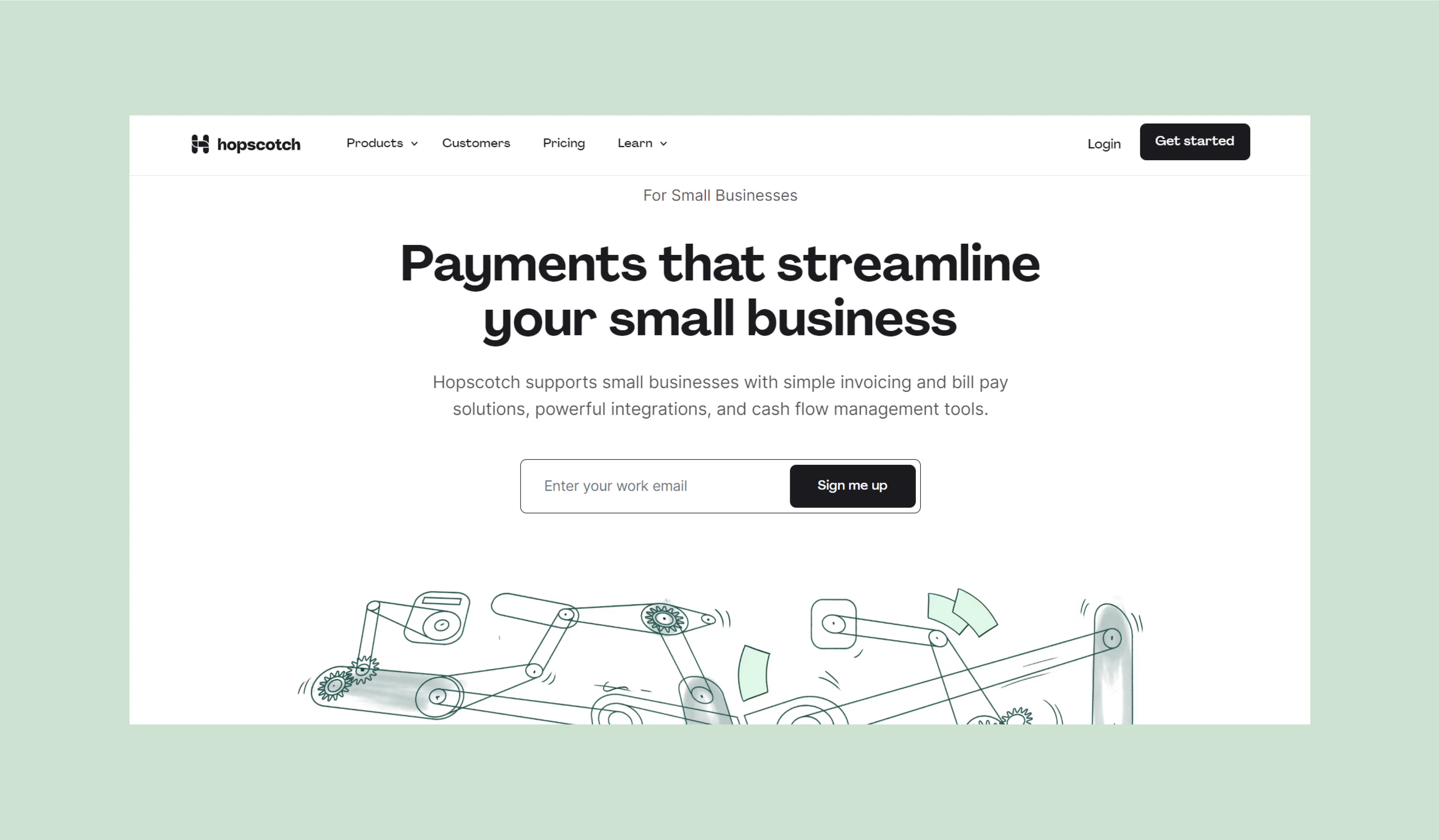
Home page: Engage the user and show how the product can help
Most platforms design the home page with these features included:
- an engaging headline
- value proposition
- a screenshot or video of the product
- a demo version
- a brief description of features and benefits
- customer reviews
- a call to action
These are standard elements that have proven to be effective, but this can also lead to a company losing its identity and uniqueness since it follows the same format as many other websites. Therefore, we will take a fresh look at the familiar things that make the home page memorable.
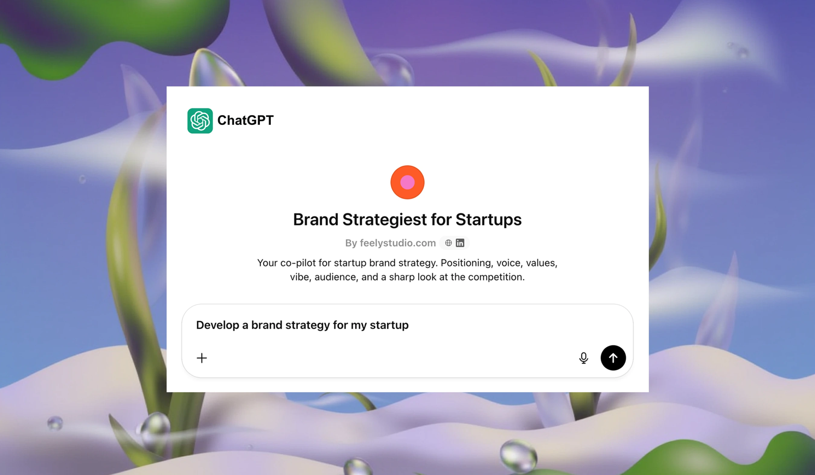
First screen: Hook the user
Screenshot of the interface with your offer
Screenshots are the most popular option that SaaS platforms use to visually complement the value proposition made by the company. It seems that there is nothing easier than to make and post a picture, but mistakes can still be made, causing the user to leave the website.
For example, displaying an overly complex interface on the first screen can scare off a visitor. After all, they came to the platform to organize their life and receive a service, not to get overwhelmed with complicated interfaces and confusing pictures.
There are 2 ways to fix an overloaded interface:
- Display it in a simplified form
- Break it down into several main functions and create a separate screenshot for each


Screencast, animation, and explainer
More advanced tools that show the functionality of the product in real-time. This is simple and clear content that enhances engagement and conversion. Users love this format: 89% of clients purchase software after watching a video.
The optimal option is a clip up to 1.5 minutes. A 15-minute onboarding on the first screen will be excessive. At the initial stage of the funnel, the user only evaluates the offer. They will not spend a quarter of an hour learning all the functions.


Emotional photos
Even a virtual product can be shown with simple photos. They will help to define the target audience and show the person the better life that they will achieve thanks to your product. A dash of humor in the sea of seriousness is a sure way to capture a potential client's attention. Easygoing communication seems to say: "Our product will make your life carefree". And this is exactly what the user is looking for.


Illustrations reflecting the audience's image
Illustrated characters resembling the target audience will help define the service's positioning. Moreover, this approach enhances the brand's visual identity: users recognize the character, and it starts to become associated with the specific company.


Going beyond familiar boundaries
Human nature dictates that we tend to prefer and feel more comfortable with options that have stood the test of time. The same applies to website development: there are widely accepted standards that companies adhere to.
To emphasize uniqueness, one can employ abstractions, metaphors, intriguing phrases, or unconventional design solutions. If a user browses through a dozen websites with standard designs, they are more likely to choose a website that challenges the accepted norms. The key is not to go overboard and maintain clarity amidst originality.


Service description: Form an impression of the product
On average, a user studies the main page of a SaaS site for 54 seconds. Within this time, they need to understand whether the platform can solve their problems. If the description for the service functions is difficult or unclear, the person will leave the site.
To explain the product and its benefits, a lot of text is not necessary — only 3-4 sentences are enough. So, you save user time, which they will spend on the following sections moving through the funnel.


We can help to show how the service will solve the user's problems. People start using SaaS products to simplify work processes and, as a result, save time and money. The task of the site is to highlight the pain points of potential clients and show how the product will help to get rid of them.


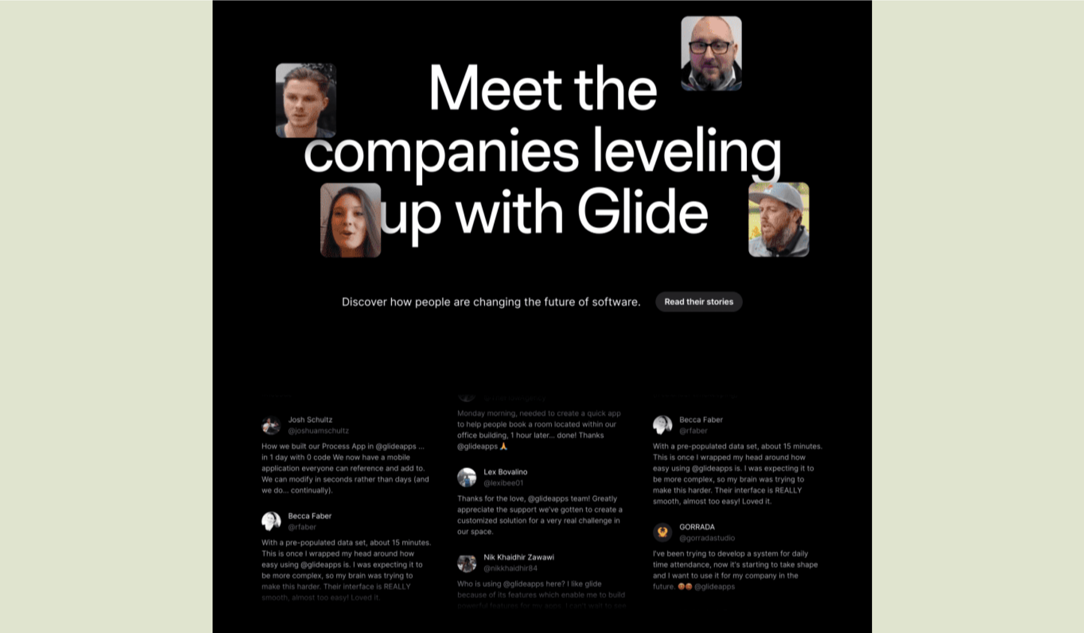
Reviews and cases: To guarantee quality and reliability
Customer stories perfectly complement the previous section. But simple reviews will not often impress anyone anymore, so we suggest using 3 alternative formats.
Video reviews
This format will inspire more trust than regular text: when we see the face of another person, our empathy automatically switches on.
Cases
These are detailed stories about the client's problem and how they solved it with your product. You can write it yourself and then coordinate it with the client.


Customer stories section
If the company has many clients who are ready to share their stories, it's time to create a separate section on the site. You can collect text reviews, videos, and cases there and place a few of the most informative ones on the main page.


Product (or features) section: Explaining the product's structure and how it works
Complex SaaS platforms may include more than two products, each having a separate page on the site. As with the main page, the features of the product are extensively described from the user's problem perspective.
Technical characteristics, product components, and integration options with other services can also be explained here. For SaaS platforms with one product, this section is unnecessary — a Features section detailing the service's capabilities is enough.
Essentially, these sections supplement the main page's information and coincide with Use Cases. It's important to explain the value proposition differently on various pages. This way, the maximum number of users will recognize themselves in at least one description.


Use cases section: Show how the product solves specific user problems
Any SaaS site should have user scenarios, which will help define how users can interact with the product.
For example, the value proposition of a CRM platform sounds like this: "Unified system for your business". If an online store is going to use the platform, three scenarios are possible:
- Manager: unifies communication with customers in one place
- Accountant: automates documentation
- Director: promptly receives sales statistics.


Therefore, on the Use Cases pages, you can clarify the main offer about the unified system and then each specialist will understand how CRM will help them. One can specify the product's audience up to a specific position, which will result in a higher conversion to paying users.


Pricing page: Explain the cost and choose a suitable price
On this page, the user makes the final decision and pays for the subscription. To do this, it's necessary to explain the pricing clearly and transparently.
The three-level structure Basic, Pro, and Enterprise can be used as a basis. The names of packages and their pricings can vary. In the last package, you may not specify the cost, instead, lead to the contacts page for the potential client to contact the sales department.


Comparative charts that show tariff differences are great. They help users choose the appropriate plan according to their tasks and budget.


Resources section: To provide benefit and explain how to use the product
This is where useful information, materials, and tools for clients are collected. Here are 6 ideas to include in this section:
Blog
These are articles, tutorials, advice, and other helpful content related to your field of activity.
Templates
These are examples or premade layouts that users can use in their projects to facilitate the process.
Courses, webinars, and video tutorials
These materials will help teach users how to use your product.


Cases
The personal experience and successes of clients will help new users better understand how the product solves their problems.
FAQ and Knowledge Base
Here, users can find answers to their questions, setup guides, instructions for using the product.
Technical Support
Buttons and contact forms are useful if users encounter difficulties. This section will also allow collecting feedback from clients and improving the product.


Our structure is a flexible foundation for those planning to create a SaaS website from scratch. The task of this architecture is to build effective conversion paths.
If you know who your customer is and why they use your platform, you will be able to properly structure the funnel and think through the optimal positioning of the brand. As a result, the site will give the user a clear understanding of the product, answer doubts and provide solutions, and turn a stranger into a paying customer.
But the identity problem is not solved with ready-made templates. The examples from the article show that websites can be designed differently. It's important to observe, learn, and implement the best solutions. You can start with our case studies for Acurast and Multis.

Next