September 23, 2025
The Evolution of Fintech Design
12 minutes
In this article
The financial technology landscape has undergone a dramatic transformation over the past decade. What once was a conservative, institution-heavy industry dominated by traditional banks has evolved into a vibrant ecosystem of digital-first companies prioritizing user experience above all else. Today's fintech leaders understand that great design isn't just about aesthetics — it's about building trust, reducing complexity, and making financial services accessible to everyone.
The stakes couldn't be higher. With 73% of users willing to switch banks for a better user experience, design has become the ultimate differentiator in fintech. Companies like Monzo, Nubank, and Robinhood haven't just disrupted traditional banking — they've redefined what users expect from financial services through thoughtful, human-centered design.
Core design principles for fintech success
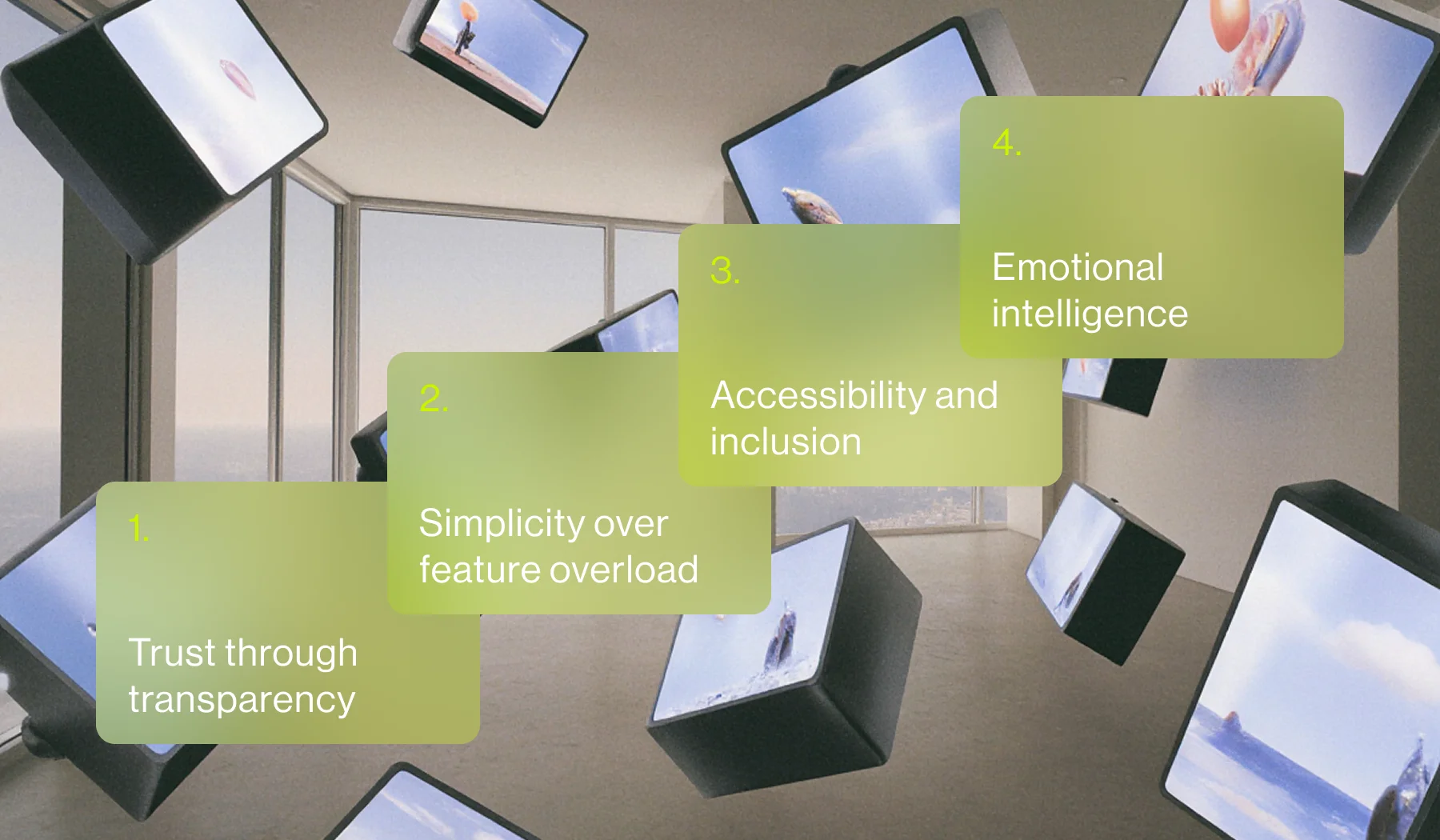
1. Trust through transparency
Financial applications handle users' most sensitive data and life savings. Every design decision must reinforce credibility and security. This means:
- Clear communication: No hidden fees, transparent terms, and straightforward language
- Visual consistency: Professional typography, cohesive color schemes, and polished interfaces
- Immediate feedback: Real-time transaction updates and clear confirmation states
2. Simplicity over feature overload
Financial products are inherently complex, but the user experience shouldn't be. The best fintech designs follow the principle of progressive disclosure:
- Focus on primary actions: What does the user need to do most often?
- Hide complexity: Advanced features should be discoverable but not prominent
- Intuitive navigation: Users should never feel lost or confused about next steps
- Cognitive load reduction: Minimize decisions and mental effort required
3. Accessibility and inclusion
Financial services should be available to everyone, regardless of technical ability or physical limitations:
- Universal design principles: Interfaces that work for users with disabilities
- Multiple interaction methods: Voice, touch, and traditional input options
- Clear visual hierarchy: High contrast, readable fonts, and logical information architecture
- Cultural sensitivity: Design that works across different languages and cultural contexts
4. Emotional intelligence
Money is deeply personal and emotional. Great fintech design acknowledges this:
- Positive reinforcement: Celebrating financial wins and progress
- Empowerment: Helping users feel in control of their financial future
- Human touch: Personality in the interface without sacrificing professionalism
Current design trends shaping fintech in 2024-2025
AI-powered personalization
Artificial intelligence is revolutionizing how financial apps adapt to individual users. Modern fintech applications leverage machine learning to:
- Provide personalized financial insights and recommendations
- Predict user behavior and surface relevant features
- Automate routine tasks like expense categorization
- Offer contextual help and guidance
The key is making AI feel helpful rather than intrusive, with clear explanations of how automated decisions are made.
Gamification and behavioral design
Financial wellness is increasingly gamified to encourage healthy money habits:
- Achievement systems: Badges and milestones for financial behaviors
- Social elements: Leaderboards and community challenges
- Habit formation: Daily streaks and routine-building features
Companies like Qapital and YNAB have proven that making finance fun can drive long-term engagement and better outcomes.
Biometric authentication and frictionless security
Security and convenience no longer need to be at odds. Biometric authentication methods are becoming standard:
- Fingerprint and face recognition: Quick, secure access without passwords
- Behavioral biometrics: Detecting fraud through typing patterns and device usage
- Multi-factor authentication: Layered security that doesn't feel burdensome
Vibrant visual identity
The era of conservative banking design is over. Modern fintech brands embrace:
- Bold color palettes: Standing out in a crowded marketplace
- Distinctive illustrations: Custom graphics that convey brand personality
- Dynamic animations: Microinteractions that delight without distracting
- Modern typography: Clean, readable fonts that feel contemporary
Brands like Revolut and Cash App have shown that financial services can be visually exciting while maintaining credibility.
Conversational interfaces
Chatbots and conversational AI are becoming more sophisticated and human-like:
- Natural language processing: Understanding user intent in plain English
- Context awareness: Remembering previous conversations and user history
- Proactive assistance: Reaching out with helpful insights and reminders
- Seamless handoffs: Smooth transitions between AI and human support
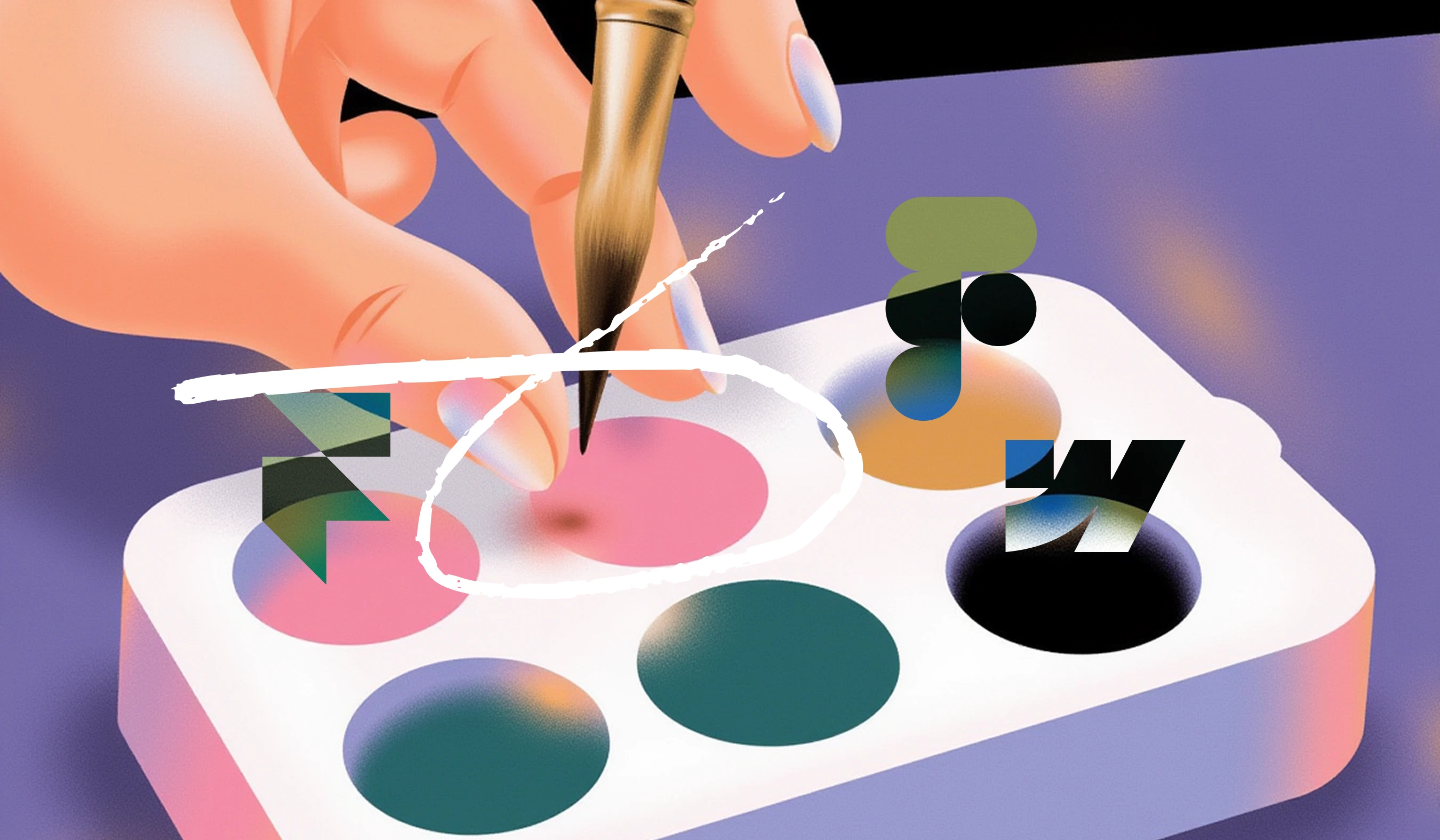
Brand character analysis: personality through design
Let's examine how leading fintech brands craft distinct personalities through their visual identities, following the order from our design inspiration collection:
Taxfix (by KallanCo): The approachable tax expert
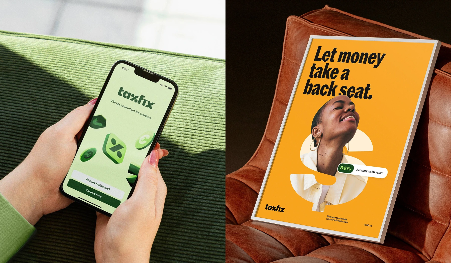
Taxfix transforms the intimidating world of tax preparation into a clear, user-friendly experience that feels more like a tech product than traditional financial services.
- Brand personality: Empowering, expert and approachable — the identity balances technical precision with warmth so users feel confident and supported, not overwhelmed.
- Design strategy: Built around the strategic idea “Fix finance for all,” the redesign aims to extend Taxfix beyond taxes into a broader suite of consumer finance tools by centering simplicity, and user empowerment.
- Brand positioning: A market leader scaling across Europe — the refresh asserts leadership, supports product range expansion and helps the company communicate ambition to both customers and employees.
- Typography: The custom choice ROM is used to signal technical rigour with a human touch, pairing precise letterforms with a friendly tone.
Brand lesson: To turn a complex financial service into a trusted consumer product you must combine clear strategy with a humane visual system — vivid, accessible colour, financial motifs and people-centred imagery can make expertise feel empowering rather than intimidating.
FinTech Collective (by High Tide): The human venture capital
Brand character: Approachable innovation hub
Breaking away from stereotypical serious financial branding to create a "human and accessible" venture capital experience.
- Visual transformation: From traditional formal identity to light, vibrant, and playful visual language
- Typography strategy: Lyon serif for headings paired with America sans-serif, balancing authority with approachability
- Design philosophy: "Distinctly ownable and unique system" featuring engaging photography and soft illustrations
- Brand positioning: Dynamic, human-centered organization that understands innovation and connection rather than rigid institutional formality
Brand lesson: Venture capital firms can differentiate by abandoning financial sector conventions in favor of creative, human-centered design that makes complex investment concepts feel accessible.
Solflare (by Ragged Edge): The crypto stronghold
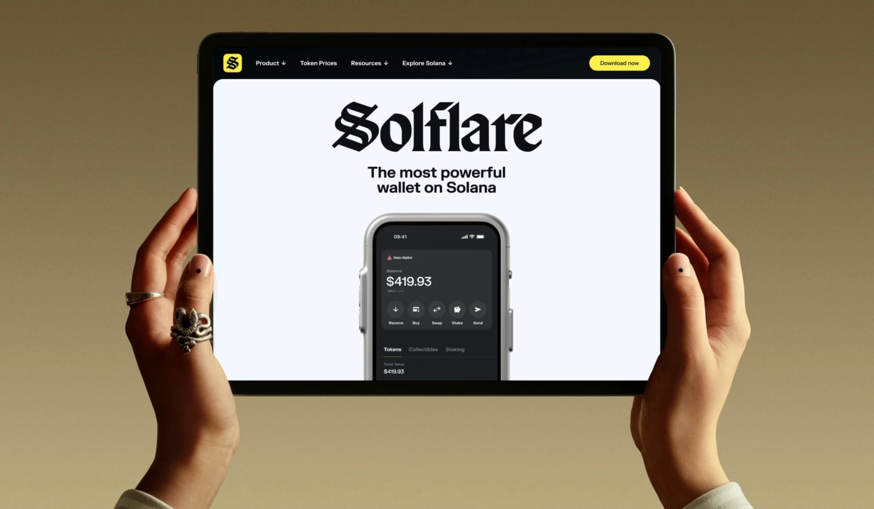
Brand character: Battle-tested guardian
Positioned as the "Stronghold of the Free" that provides security and transparency in a chaotic crypto landscape plagued by scams.
- Visual heritage: Logo inspired by "script of the earliest bank charters," borrowing credibility from traditional banking
- Brand personality: "Level-headed, battle-tested, and iron-willed" to communicate strength and reliability
- Typography: ABCDiatype and Grit fonts with reimagined money engraving illustration style
- Color strategy: Yellow and heavy metal tones that evoke both traditional banking and modern crypto innovation
- Messaging: "Making interacting with Solana simple, seamless and most importantly, secure"
Brand lesson: Crypto wallets can achieve mainstream adoption by borrowing visual trust signals from traditional banking while maintaining digital innovation credibility.
Tilt (by Ragged Edge): The underdog champion
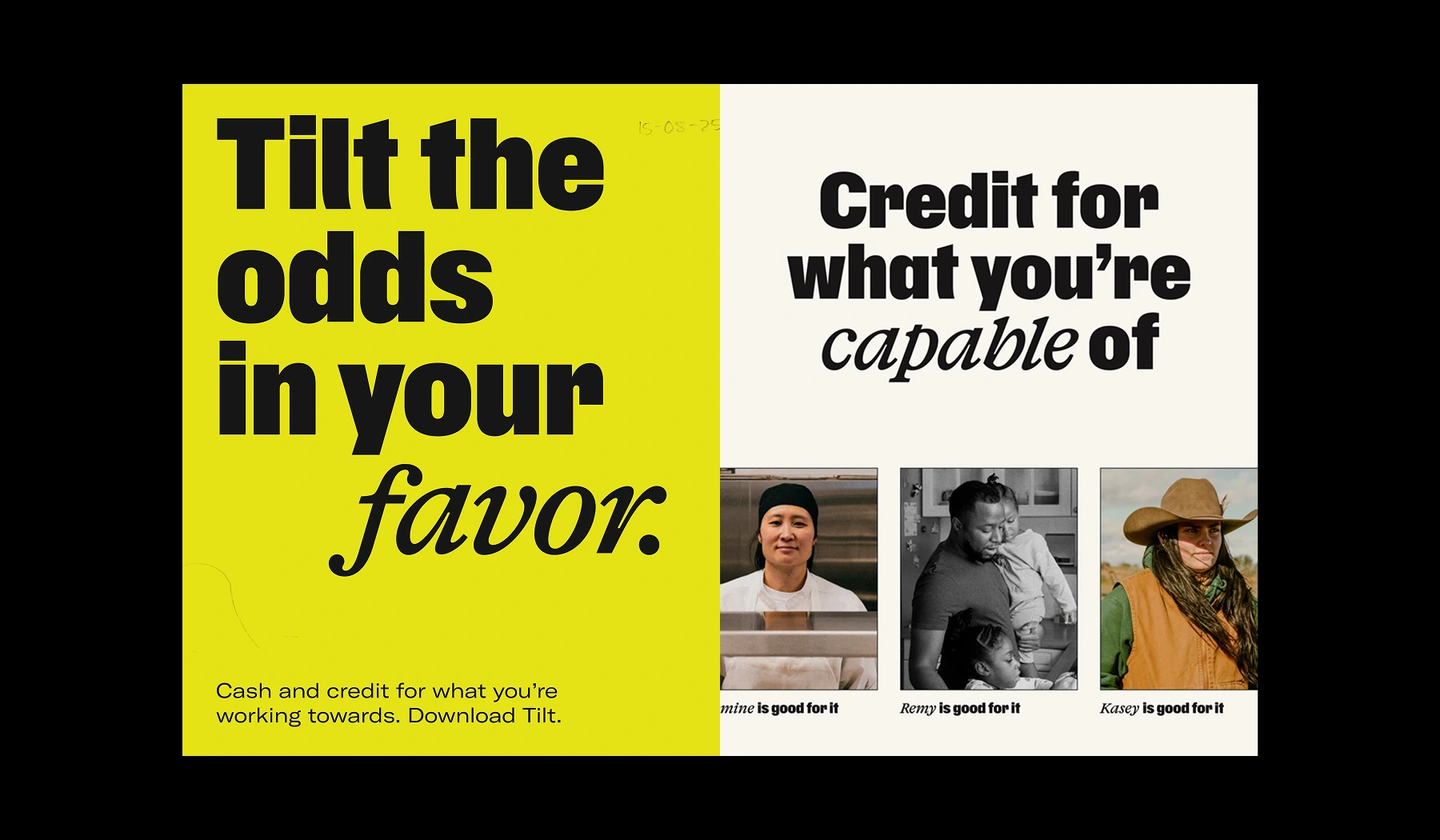
Brand character: Soulful credit advocate
Tilt is a mission-driven credit brand that tilts the odds back in favour of hard-working people by offering fair, accessible credit products that don’t rely on traditional credit checks, interest, or late fees.
- Brand personality: Soulful, intelligent and unwavering — a brand that backs human endeavour with grit and optimism rather than pity.
- Design strategy: Rename and reframe the product around a clear mission; a signature-style logo, a customised tilted headline script, and an illustrative brushstroke system bring urgency, humanity and a sense of craft to the identity.
- Brand positioning: A purpose-led entrant in consumer credit that moves from crisis-first support to a long-term financial partner, signalling fairness and scale while aligning recent acquisitions under a unified identity.
- Typography: A bespoke headline script that literally leans into the idea of a “tilt,” giving headlines urgency and personality while pairing with more stable type for clarity.
Brand lesson: Grounding a financial product in a clear belief in people lets you design beyond utility — bold identity choices, genuine voice and human-centred visuals can turn measurable marketing uplift and product alignment into lasting trust.
Robinhood (by Porto Rocha): The maturing disruptor
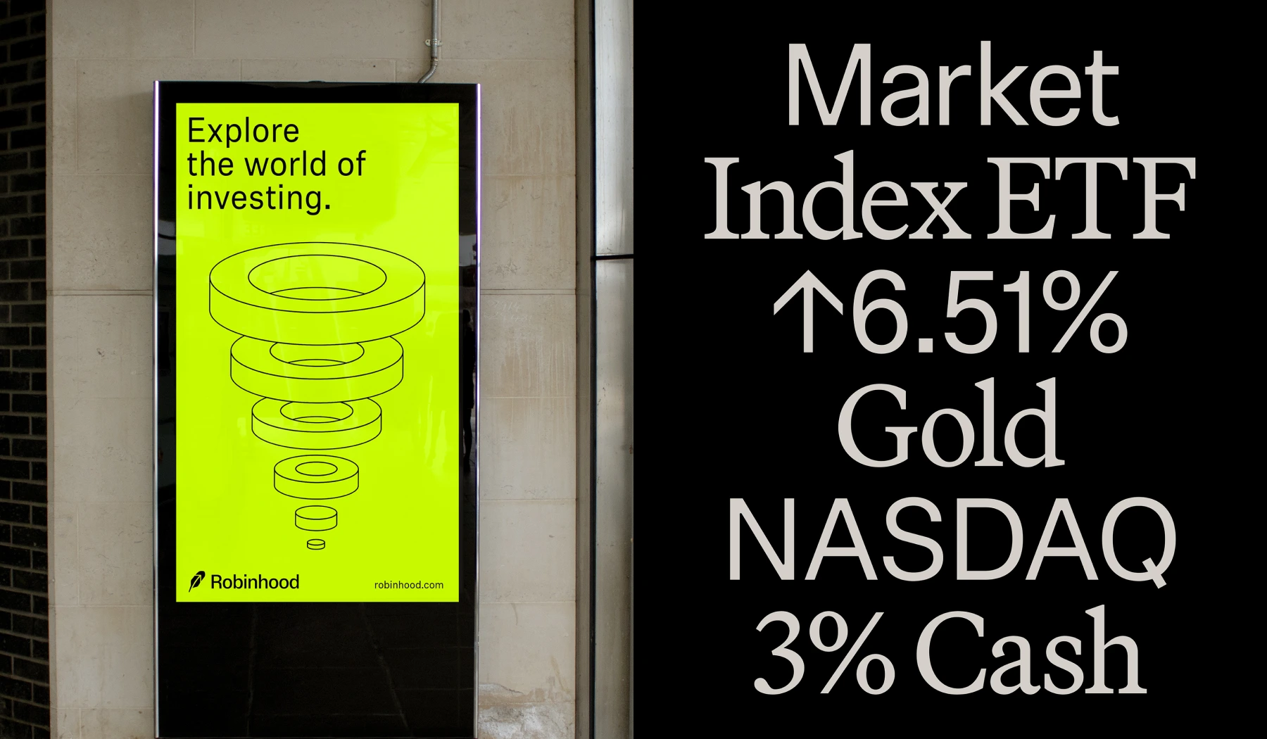
Brand character: A grown-up identity for a finance pioneer — Robinhood’s rebrand shifts the product from youthful disruptor to a sharper, more scalable financial platform while keeping a distinct consumer-facing edge.
- Brand personality: Confident, precise and intentionally mature — it trades cheeky disruptor energy for expert calm without becoming cold.
- Design strategy: Strip back excess, amplify the upward arrow inside the feather, and build a modular visual language: a restrained neutral palette with a single electric accent, a technical illustration system inspired by financial charts, and a stylised photographic approach that zooms in on singular subjects to convey concepts.
- Brand positioning: An evolution from mass-market trading app to a holistic financial platform for seasoned users, designed to flex across stocks, crypto and premium products like Robinhood Gold while signalling leadership and long-term credibility.
- Typography: A new sans (RH Phonic) with subtle ink-traps for character and precision, paired with the warm, intelligent serif Martina Plantijn for headlines to balance authority with approachability.
Brand lesson: When a fintech category matures, clarity and restraint become strategic assets — a focused mark, disciplined palette, and scalable visual system let a consumer brand trade novelty for trusted expertise while remaining distinctive.
Avenia: The crypto pioneer
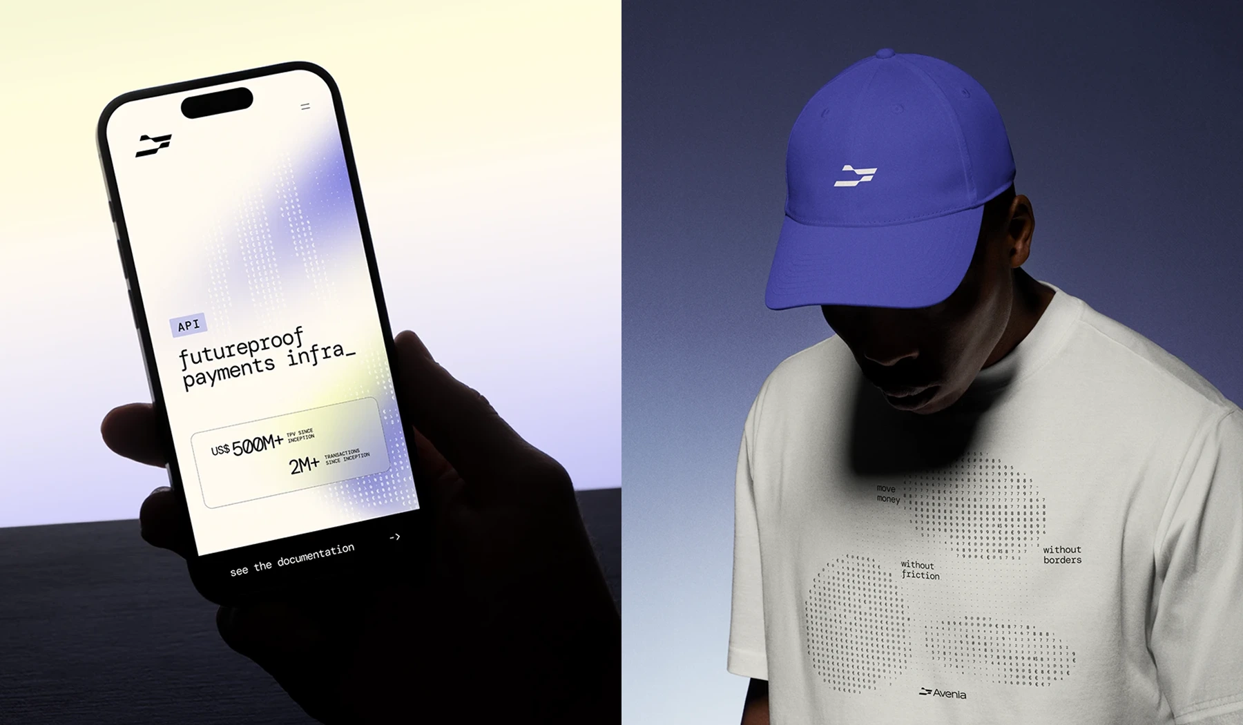
Avenia turns a stablecoin infrastructure into a vision of “fluid stability” — robust, secure rails for money that also feel flexible, borderless and adaptable.
- Brand personality: Solid yet agile — authoritative and reliable with a gentle, progressive warmth that signals technological confidence.
- Design strategy: Rebrand from BRLA to Avenia around the “fluid stability” concept: a structured yet malleable symbol, numerical/typographic graphic motifs, and gradients that suggest dissolving geographic and financial boundaries.
- Brand positioning: From a Brazil-focused stablecoin reference to a scalable infrastructure player aiming to enable secure, efficient, borderless movement of value across Latin America and the world.
- Typography: A restrained, secure typographic voice that balances solidity with readability, reinforcing trust while supporting the fluid visual system.
Brand lesson: Visual robustness combined with fluid, human-centred elements communicates technical credibility while suggesting openness and cross-border ambition — clarity, coded graphics and a humane palette make complex infrastructure feel accessible.
Lloyds (by Wolffolins): The heritage innovator
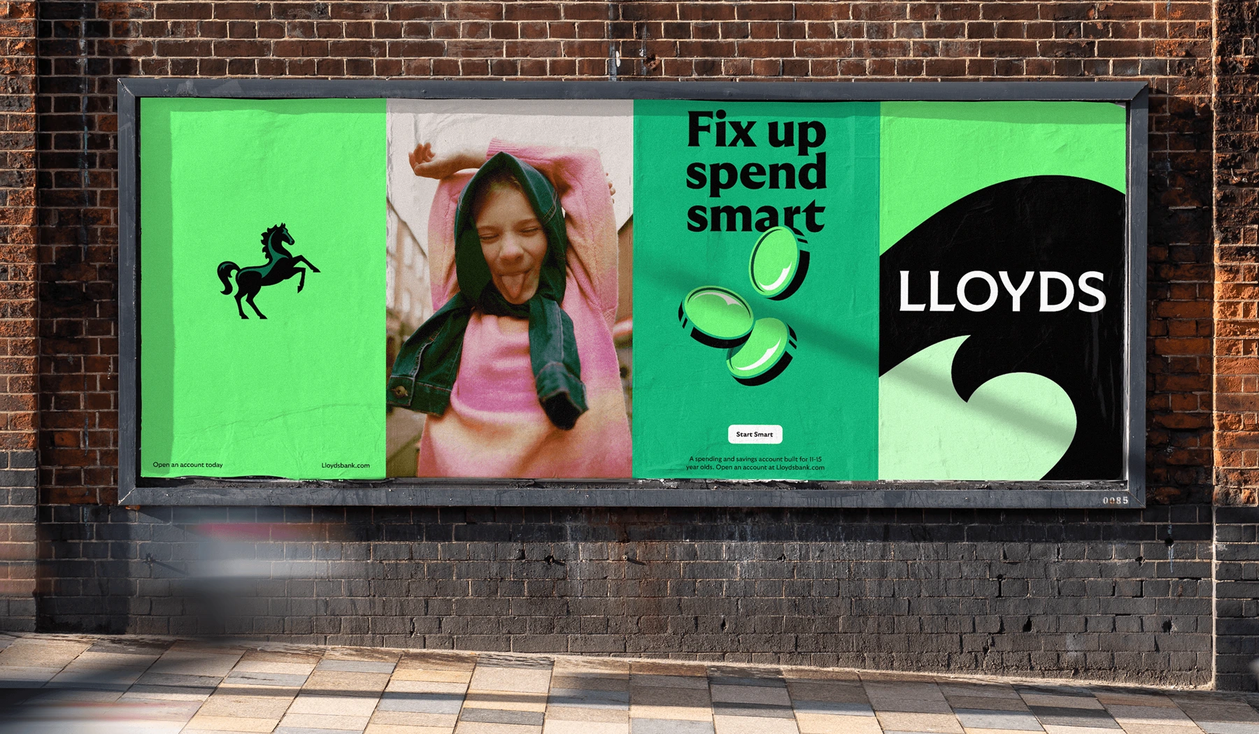
Brand character: Progressive heritage bank
Centuries of banking heritage reimagined through "The Cancara Philosophy" for digital-first customers.
- Core positioning: "Lloyds moves everyone forward" - helping customers progress financially, especially those feeling "stuck"
- Visual evolution: Evolved black horse logo with refined anatomy and interactive motion behaviors from classic horse movements
- Typography: Customized GT Ultra typeface inspired by early 20th-century British fonts, rendered dynamically with variable weights
- Color strategy: Reinvigorated Lloyds green nodding to "the greenery of Britain's landscape"
- Design philosophy: Grounded, pragmatic British sensibility that's forward-looking and adaptive
- Brand mission: Pragmatic approach intended to guide product development and innovation
Brand lesson: Heritage banks can modernize successfully by evolving their visual assets while respecting their historical foundation, creating timeless identities that deliver contemporary experiences.
Zed (by Super Keen Studio): The lightning-fast credit challenger
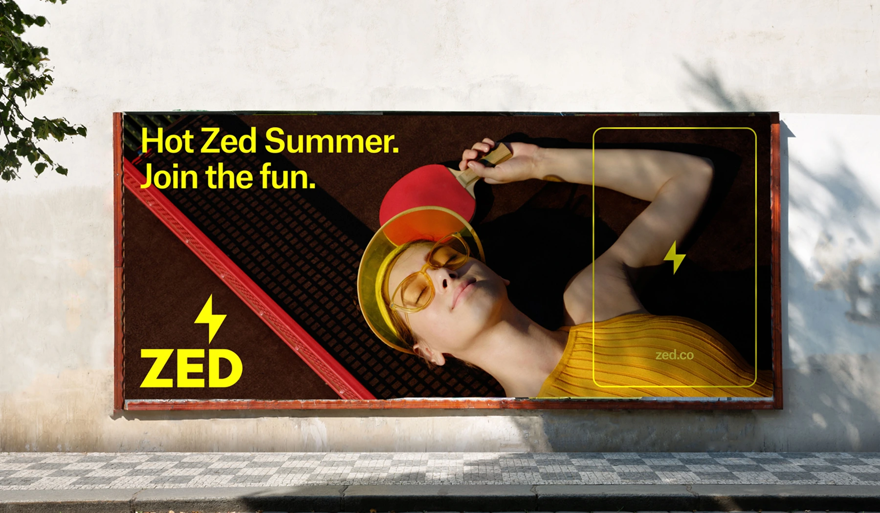
Brand character: High-energy youth champion
Targeting Southeast Asian young professionals with a bold challenger bank that "supercharges progress" rather than passive waiting.
- Brand mission: "Challenge the status quo—not just in banking, but in the way young people in the region saw their own achievements"
- Visual identity: Lightning bolt symbolizing energy and momentum with neon color palette and high-contrast design
- Card design: So distinctive it's recognizable without additional branding
- Verbal strategy: Celebrates "little wins" and encourages ambition, speaking to "Tiktok generation" aspirations
- Art direction: Commissioned Filipino-American artist for hero illustration, 3D elements from Knitted City
- Cultural integration: Reflects "vibrancy and richness of Manila" while targeting ambitious young professionals
- Website approach: Balances clean information architecture with "moments of energy and excitement"
Brand lesson: Regional fintech can build powerful youth connections through high-energy visual languages that celebrate local culture while encouraging personal ambition.
Brite (by MultiAdaptor): The payment revolutionary
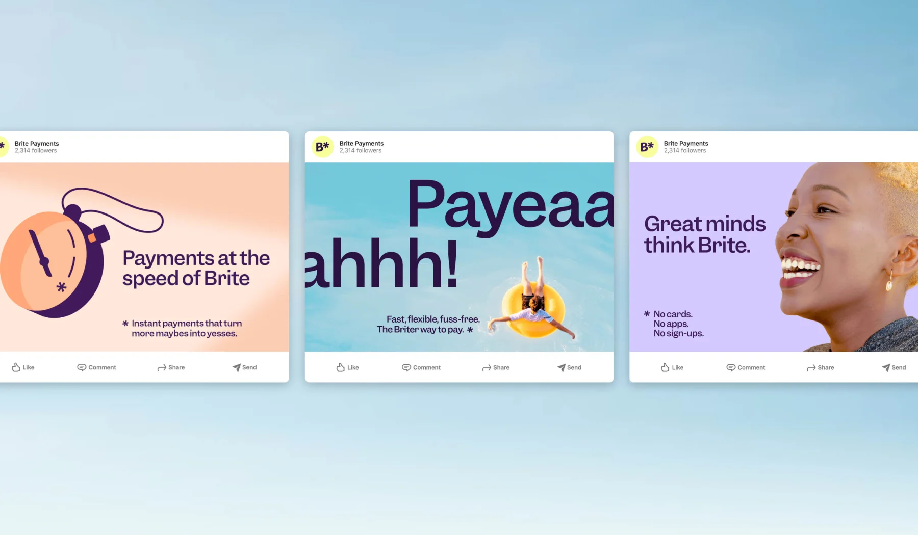
Brand character: Next-generation payment simplifier
Brite is a next-generation instant payments provider that makes bank-account payments feel fast, simple and delightfully human — designed to cut through the opacity of payments and win attention at tiny checkout moments.
- Brand personality: Optimistic, witty and helpful — a beacon-like voice that riffs on the product name to make payments feel more human than technical.
- Design strategy: The identity is built around “The Briter Way” — an asterisk motif as a point of activation, playful illustrations, distinctive small-size typography and delightful micro-interactions to create memorable moments without disrupting checkout flow.
- Brand positioning: Positioned as the simple, consumer-friendly instant payment option for European e-commerce — no apps, cards or signups — engineered to stand out in crowded checkout space
Brand lesson: Payment platforms can differentiate by positioning against industry complexity, using "bright" visual metaphors to communicate clarity and speed in traditionally opaque financial processes.
Breastmilk Money (by Serviceplan International): The maternal finance pioneer
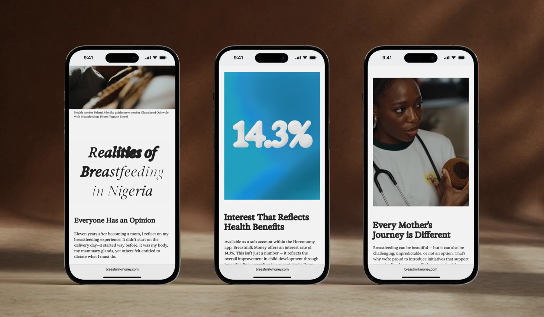
Brand character: Care-to-capital innovator
Revolutionary financial product that transforms breastfeeding into financial opportunity for Nigerian women.
- Brand personality: Compassionate, pragmatic and empowering — the product speaks to mothers with dignity and practical support rather than pity.
- Design strategy: Translate a social insight into a product — an in-app savings account that models WHO breastfeeding curves, converts avoided formula costs into monthly transfers, and uses a research-inspired 14.3% interest hook to make value tangible.
- Brand positioning: A women-first digital bank that repositions breastfeeding from invisible care into a measurable financial opportunity, combining health, social advocacy and consumer finance in the Nigerian market.
- Typography: Clean, utilitarian typographic treatment that prioritises legibility and straightforward communication across app screens and campaign materials, supporting the idea-first storytelling.
Brand lesson: Socially innovative fintech can create entirely new product categories by identifying underserved needs and developing culturally sensitive design languages that authentically serve specific communities.
Nubank (by Pentagram): The purple banking disruptor
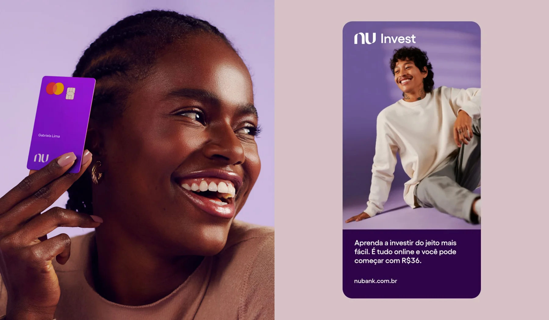
Brand character: Transparent digital bank
Disrupting traditional Brazilian banking with "fair and transparent service" and "frank and human" communication.
- Brand evolution: Dropped "bank" from brand mark to indicate broader business potential beyond traditional banking
- Visual identity: Retains signature purple ("roxinho") with expanded vibrant palette "inspired by art, fashion and culture"
- Design system: Modular approach allowing flexible content expansion across digital platforms
- Brand personality: Playful, simple mark inspired by "Nu" ("naked" in Portuguese), emphasizing transparency
- Typography approach: Bold layouts with strong typography paired with natural, people-centered imagery
- Mission: "Positively transform the relationship between people, money and society" while cutting through financial complexity
- Cultural DNA: Distinctly Latin American character that respects regional preferences while delivering global innovation standards
Brand lesson: Regional digital banks can achieve massive scale by maintaining authentic cultural identity while simplifying complex financial services through transparent, human-centered design approaches.
YoungCapital NEXT (by Verve agency): The career rebel
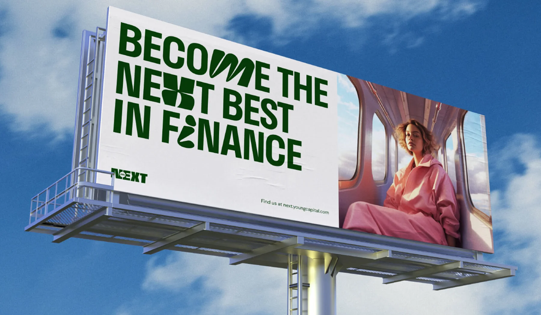
Brand character: Individual transformation champion
Empowering ambitious young professionals by challenging traditional career narratives and celebrating individual transformation.
- Brand mission: Challenges conventional career norms while empowering individual professional journeys
- Visual identity: Dynamic, bold, and edgy design approach symbolizing diverse and unpredictable career paths
- Core elements: Brand icon representing complex growth journey, non-standard expressive typeface
- Color strategy: Vibrant mix balancing maturity with boldness, adding texture for authenticity and "grit"
- Brand personality: Courageous, rebellious, transformative, and socially relevant
- Messaging philosophy: "Toughness" in capturing one's true self while breaking away from conventional career expectations
- Design approach: Adaptable visual language incorporating photography to reflect diverse experiences
- Differentiation: Transforms traditional career development narrative into dynamic, personalized professional growth story
Brand lesson: Career-focused fintech platforms can build strong generational loyalty by authentically challenging industry conventions and celebrating individual transformation over traditional professional paths.
Monzo (by Ragged Edge): The vibrant banking revolution
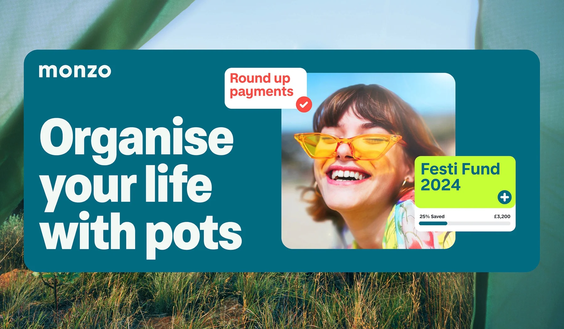
Monzo amplifies its signature hot-coral personality into a scalable identity system designed to live both inside the product and across marketing, making the brand feel unmistakably Monzo at every touchpoint.
- Brand personality: Optimistic, human and unmistakably playful — a bank that foregrounds warmth and clarity while keeping product simplicity at its core.
- Design strategy: Redesign the identity to “make Monzo even more Monzo”: intensify the hot-coral asset, add a flexible secondary palette, and create a library of modular assets and systems so the brand scales without losing its original magic.
- Brand positioning: Evolve from disruptive challenger to a mature, product-led financial platform that can scale across products and channels while supporting business growth and profitability.
- Typography: Clean, utilitarian typographic treatment that preserves readability and the brand’s signature simplicity across product screens and marketing materials.
Brand lesson: Double down on what makes a brand distinct (signature colour, tone and illustrative voice) and build a modular system around it — doing so lets you scale quickly and consistently, turning brand magic into measurable business outcomes.
BCU Bank (by Bigfish.design): The banana coast heritage champion
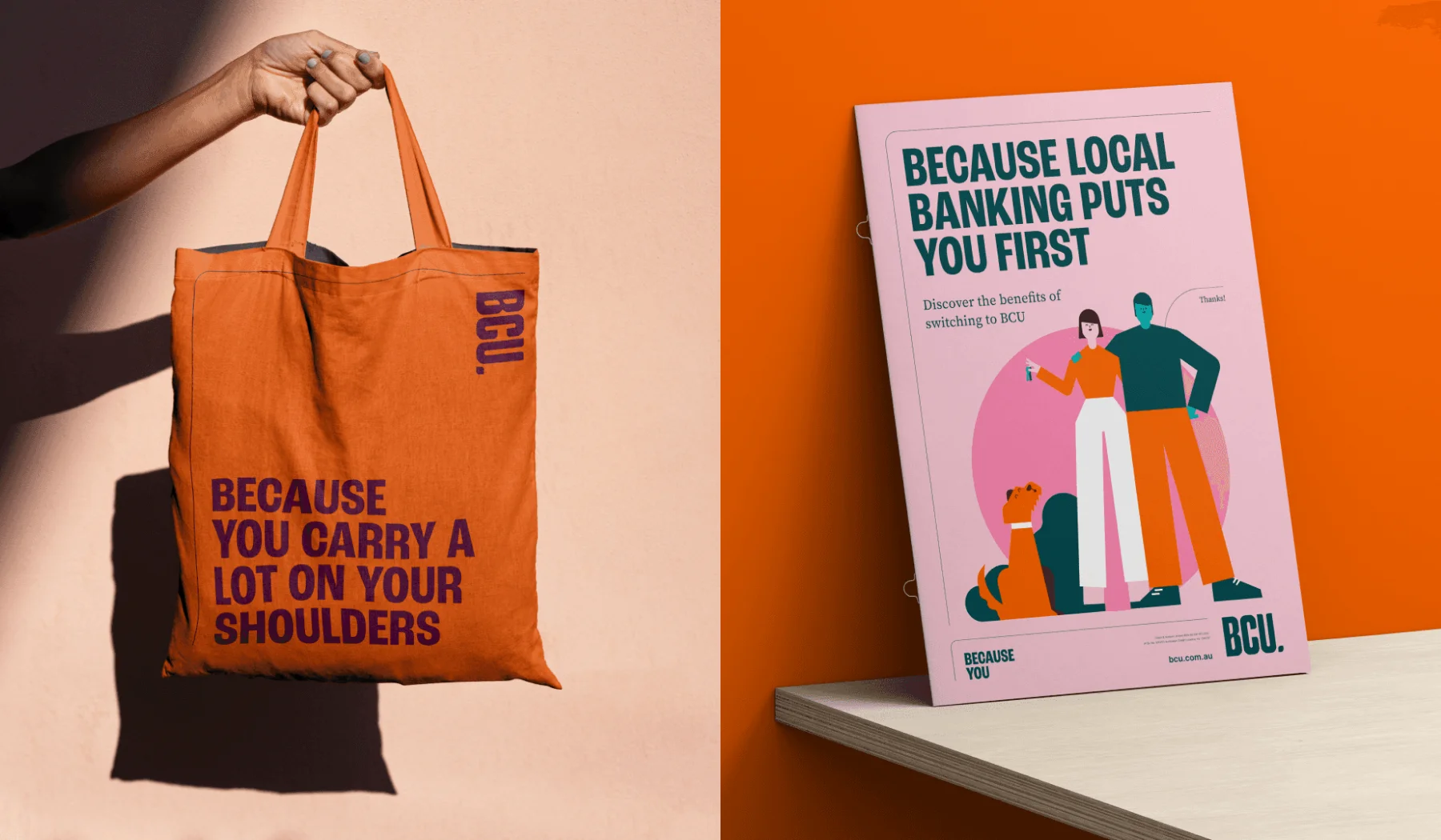
Brand character: Warm regional connector
Rooted in the Banana Coast region's history, BCU transforms traditional community banking into "banking with personality and warmth," emphasizing human connection over product features.
- Regional positioning: Deeply anchored in Banana Coast heritage while delivering modern banking experiences
- Visual identity: Banana leaf-inspired geometric shape (square with two rounded and two sharp corners) providing flexible content framework
- Color strategy: Orange and teal honoring BCU heritage, complemented by pink and purple for "modern contrast" and "soft, personal tone"
- Typography approach: Large condensed headlines paired with small serif body copy for hierarchy and readability
- Character system: Modular illustrations providing "humor and lightheartedness" while addressing "serious and life-changing moments"
- Design philosophy: People-focused imagery over product shots, creating engaging human-centered banking communication
- Collaborative development: Created with VMLY&R for comprehensive brand system across app, signage, and marketing materials
Basic Capital (by Feely): The pre-cursor to your wealth

Basic Capital makes retirement savings feel attainable and concrete — a fintech that reframes wealth-building as a series of simple, composable steps rather than an intimidating, distant goal.
- Brand personality: Confident, approachable and future-focused — knowledgeable without being remote, encouraging action with a calm, explanatory tone.
- Design strategy: Use literal building-block metaphors, a “cursor” motif and friendly illustrations to translate complex retirement mechanics into tactile, start-now moments across product, comms and OOH.
- Brand positioning: A democratizing retirement fintech that positions itself as the entry point to long-term wealth for everyday users, balancing credibility for investors with accessibility for first-time savers.
- Typography: Clean, highly legible type with strong headlines and clear hierarchy to make dense financial content feel readable and trustworthy.
Brand lesson: Turn abstraction into action — using simple metaphors, thoughtful information hierarchy and human-centred visuals lets a finance brand move from complexity to clarity, making wealth-building feel like something anyone can begin today.
Brand personality archetypes in fintech
Across these brand character analyses, several personality archetypes emerge that successful fintech companies embody:
The democratizer (Robinhood, Monzo, Basic Capital)
Breaking down traditional barriers and making financial services accessible to everyone through bold, confident design that challenges industry conventions.
The bridge builder (Solflare, Tilt)
Connecting different worlds — whether crypto to mainstream, or traditional business to modern innovation — through design that reduces intimidation while maintaining credibility.
The cultural champion (Nubank, BCU Bank)
Understanding and serving specific communities with design languages that authentically reflect local values while delivering global-standard innovation.
The purpose driver (Breastmilk Money, YoungCapital NEXT)
Using financial technology to address specific social needs or demographic challenges, with brand personalities that authentically reflect their missions.
The creative maverick (Zed, RRE Visual Journal)
Pushing boundaries of what fintech brands can be, serving niche markets that appreciate artistic innovation and unconventional approaches.
The lifestyle integrator (Brite)
Transcending traditional financial categories by positioning finance as seamlessly integrated into broader lifestyle and personal development goals.
The heritage innovator (Lloyds)
Balancing historical credibility with contemporary innovation, proving that established institutions can modernize without losing their core strengths.
The authority expert (Taxfix, FinTech Collective)
Commanding respect through specialized expertise while remaining approachable, using design to convey competence without intimidation.
Key brand insights
- Authentic positioning beats generic branding: Each successful brand has a clear, authentic reason for existing
- Visual personality must match market reality: Bold choices work when they authentically reflect the brand's actual position and capabilities
- Cultural sensitivity enhances global expansion: Brands succeed internationally by respecting local preferences while maintaining core identity
- Niche markets reward bold personalities: Specialized audiences appreciate brands that understand their unique needs and aesthetic preferences
- Trust-building varies by context: B2B brands build trust differently than consumer brands, but authenticity remains crucial across all segments

Emotional design: understanding money psychology
Money is inherently emotional, and fintech design must acknowledge this:
Stress reduction
- Calming visual design: Color palettes that reduce anxiety
- Reassuring microcopy: Language that builds confidence
- Clear next steps: Users should never feel stuck or confused
- Gentle error handling: Mistakes should feel recoverable, not catastrophic
Positive reinforcement
- Progress visualization: Showing advancement toward financial goals
- Achievement recognition: Celebrating milestones and smart financial decisions
- Empowering language: Copy that makes users feel capable and in control
Building financial confidence
- Educational integration: Learning opportunities woven into the user experience
- Predictive insights: Helping users understand the impact of their decisions
- Personalized guidance: AI-powered recommendations that feel helpful, not pushy

Conclusion: design that turns apps into relationships
Design is not decoration but a strategic advantage. People do not buy banking apps; they buy transformation and experience: confidence, simplicity, a sense of control, and belonging. When a product becomes a clear, emotionally tuned service, it stops being just a tool and becomes part of the user's life.
Good fintech design combines inclusive UX, transparent security, and a careful understanding of human psychology. It means more than a pretty wrapper. It requires thoughtful information architecture, honest communication, and moments that build trust, such as tips, explanations, gentle onboarding, and supportive microinteractions.

Next