

Brand Identity · Verbal Identity · Mascot · Web Design · Webflow development · Product Design
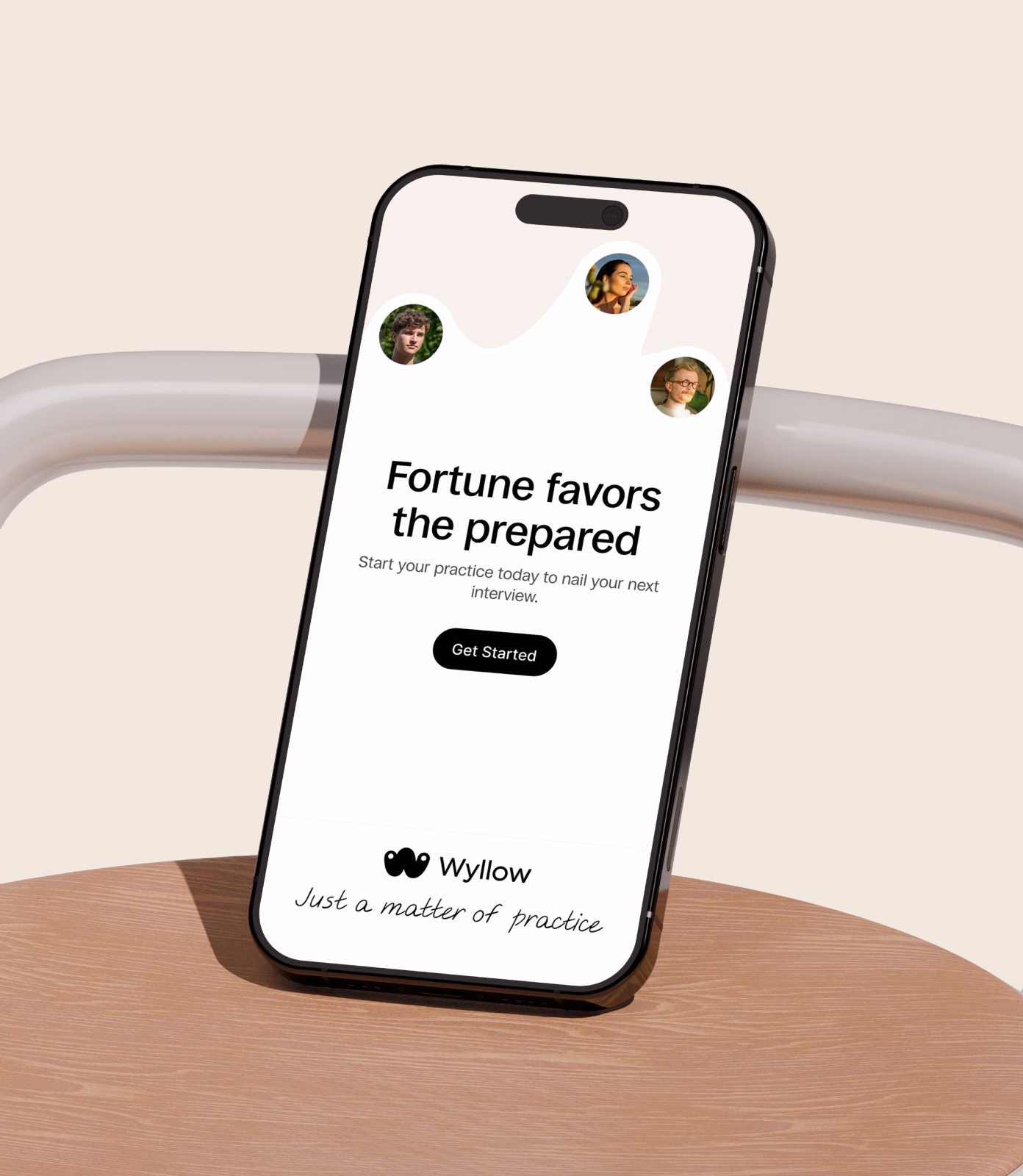
Wyllow is a human-first career development platform that helps people practice interviews, build their professional story, and walk into high-stakes moments with calm confidence.
Career tech is crowded with tools that optimize for the hiring system: faster applications, keyword-stuffed resumes, AI-generated answers. Almost none address what actually holds candidates back: anxiety, scattered preparation, and no structured way to practice.
Wyllow needed a brand that could break through that noise while delivering something most career tools miss: genuine emotional safety. Not another productivity platform, but a calm, supportive space where preparation feels like progress
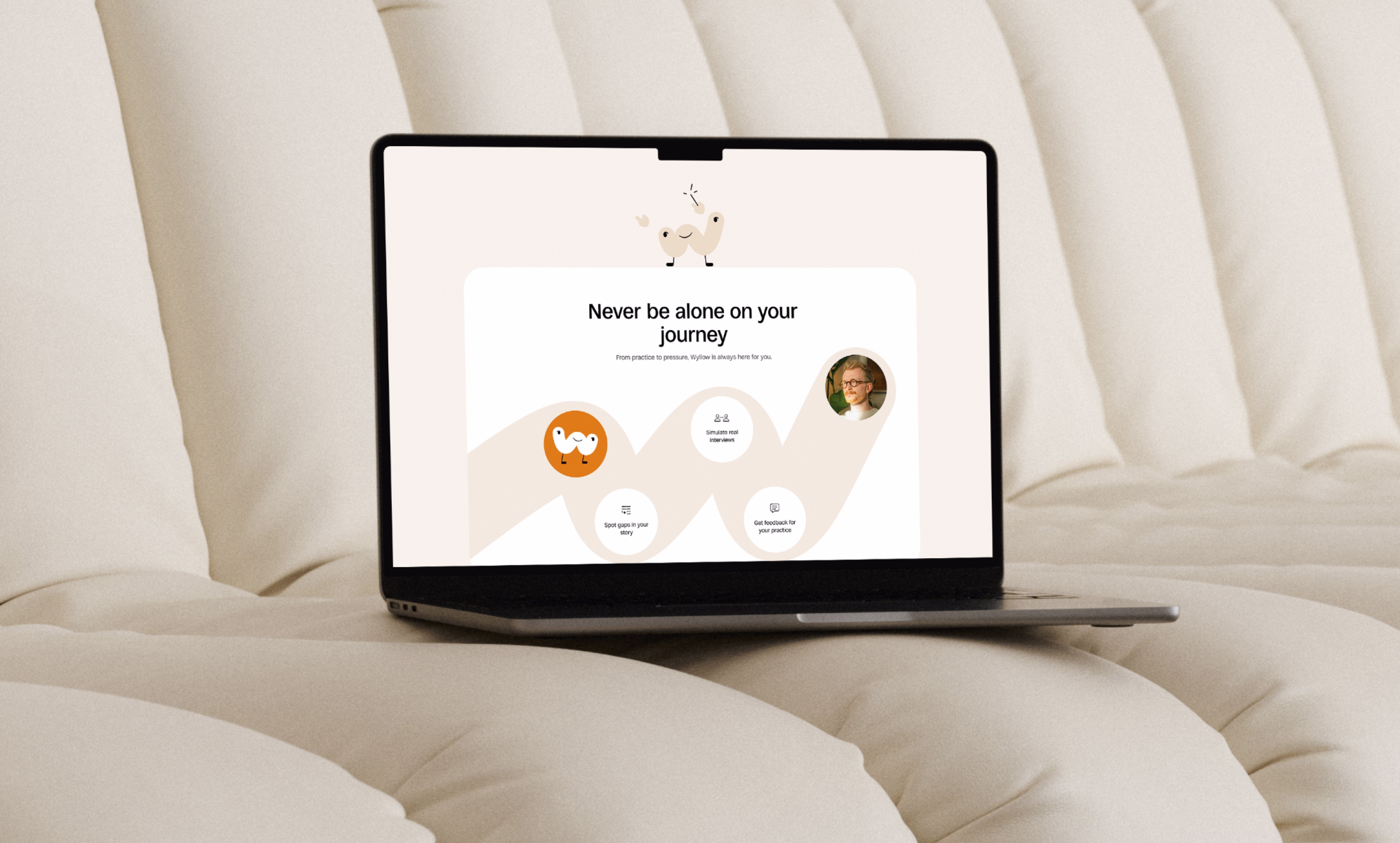
The Practice Companion became the central idea. Where most career tools position themselves as optimizers or accelerators, Wyllow needed to feel like someone walking beside you. The concept reframes interview preparation from a high-pressure performance into a calm, repeatable practice. Something you return to, not something you dread. This thinking shaped everything: a tone of voice that feels grounded and human, confident but never pushy. And a tagline that anchors the entire brand in one grounding phrase: Just a matter of practice.
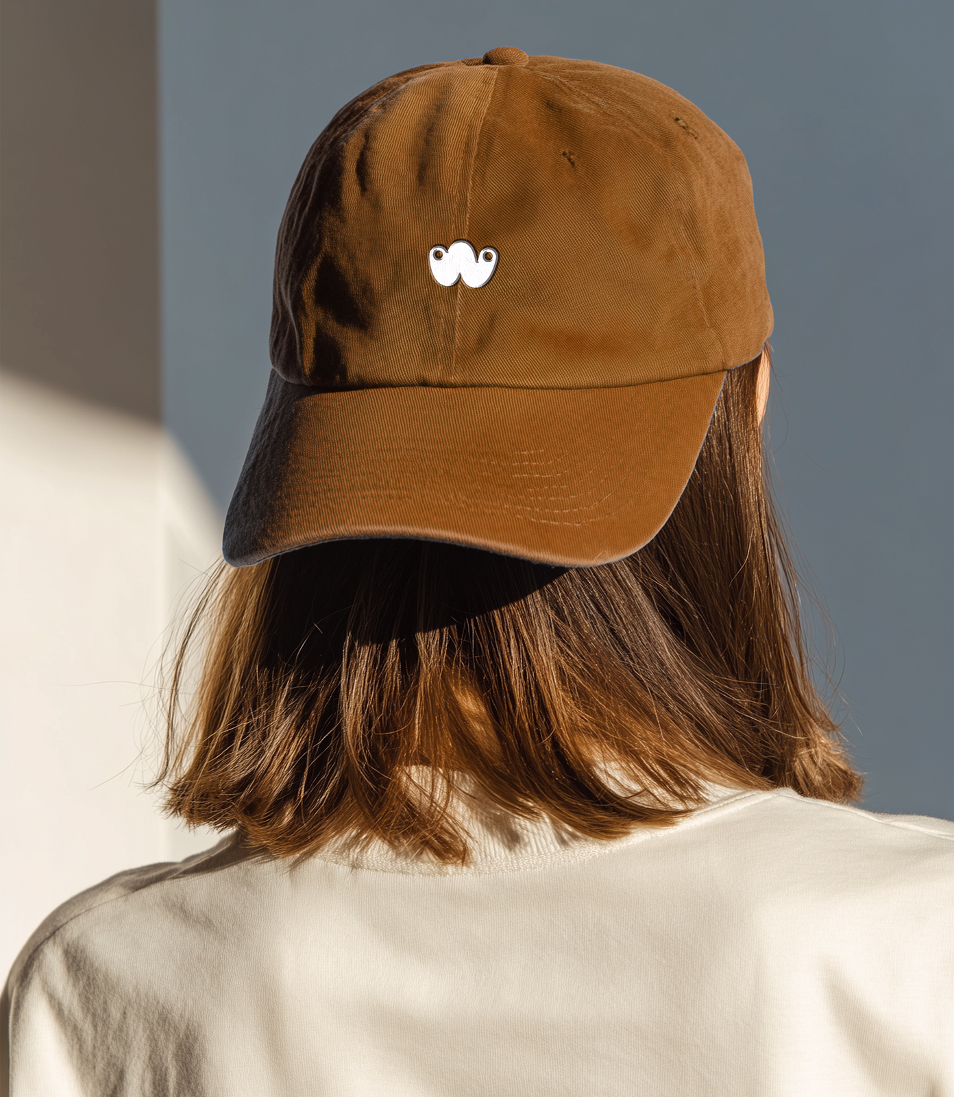

The logomark is a simplified version of the character, shaped as a "W." It works as both a letter and a path: connecting you and your ambition, you and your companion. Even at its smallest scale, the logo carries the same emotional function as the full character. It feels approachable, warm, and alive.
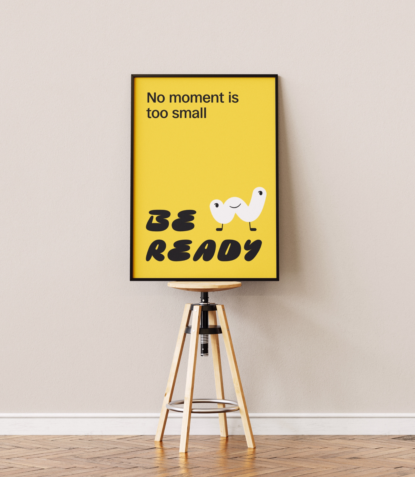
The character captures how it actually feels to use Wyllow. It celebrates your progress, cheers you on, walks with you through the hard parts. For people dealing with interview anxiety and career uncertainty, that kind of presence changes everything. A friendly companion next to you turns a stressful tool into a space that feels less like a task and more like a habit you enjoy.
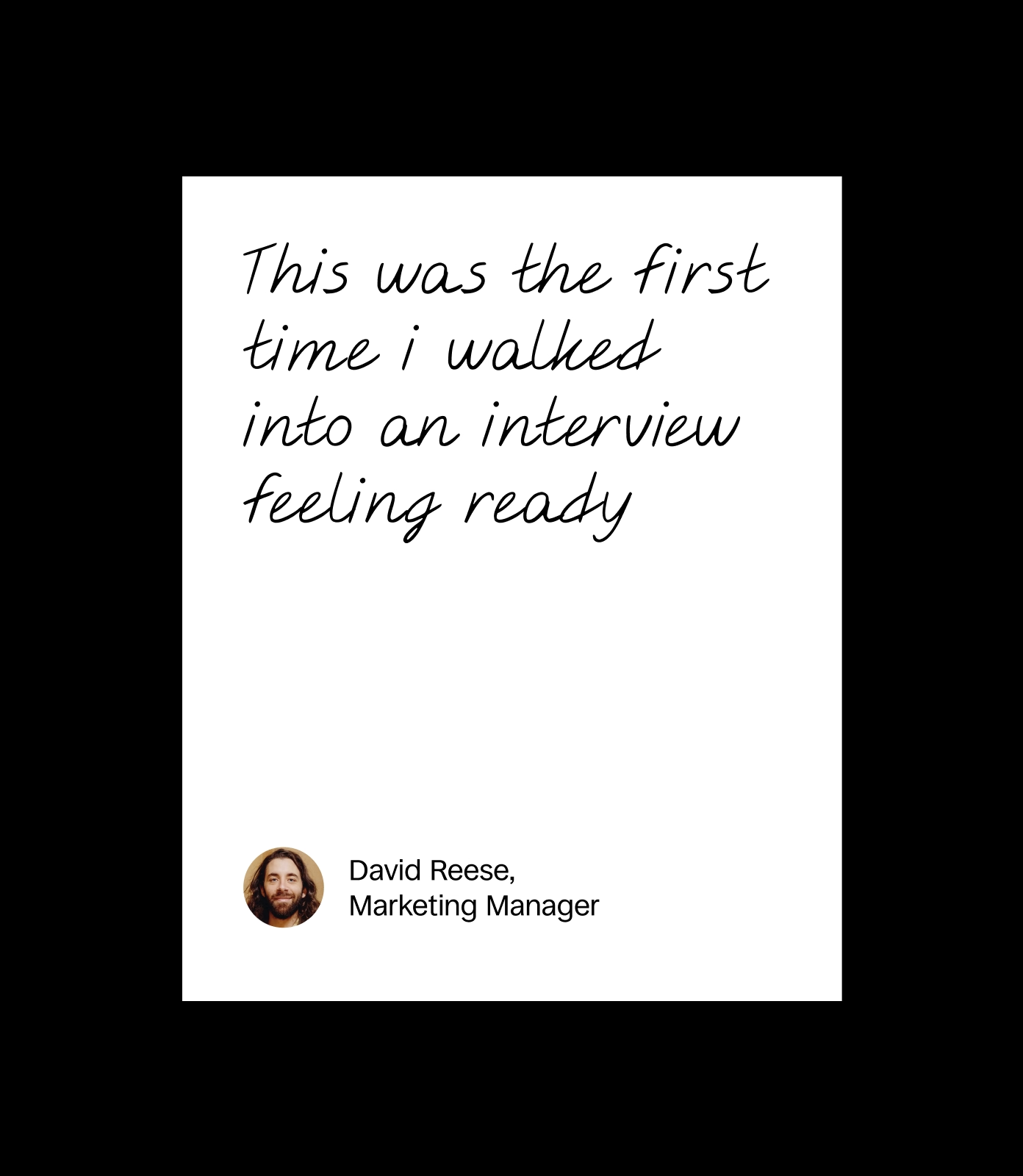
The voice we built for Wyllow does not hype you up or drown you in advice. It gives you a calm space to think clearly, practice safely, and build real confidence. Encouraging without being over-the-top, smart without being academic, structured without being stiff. Think of someone who has been there, knows it is hard, and can show a clear path that actually works.

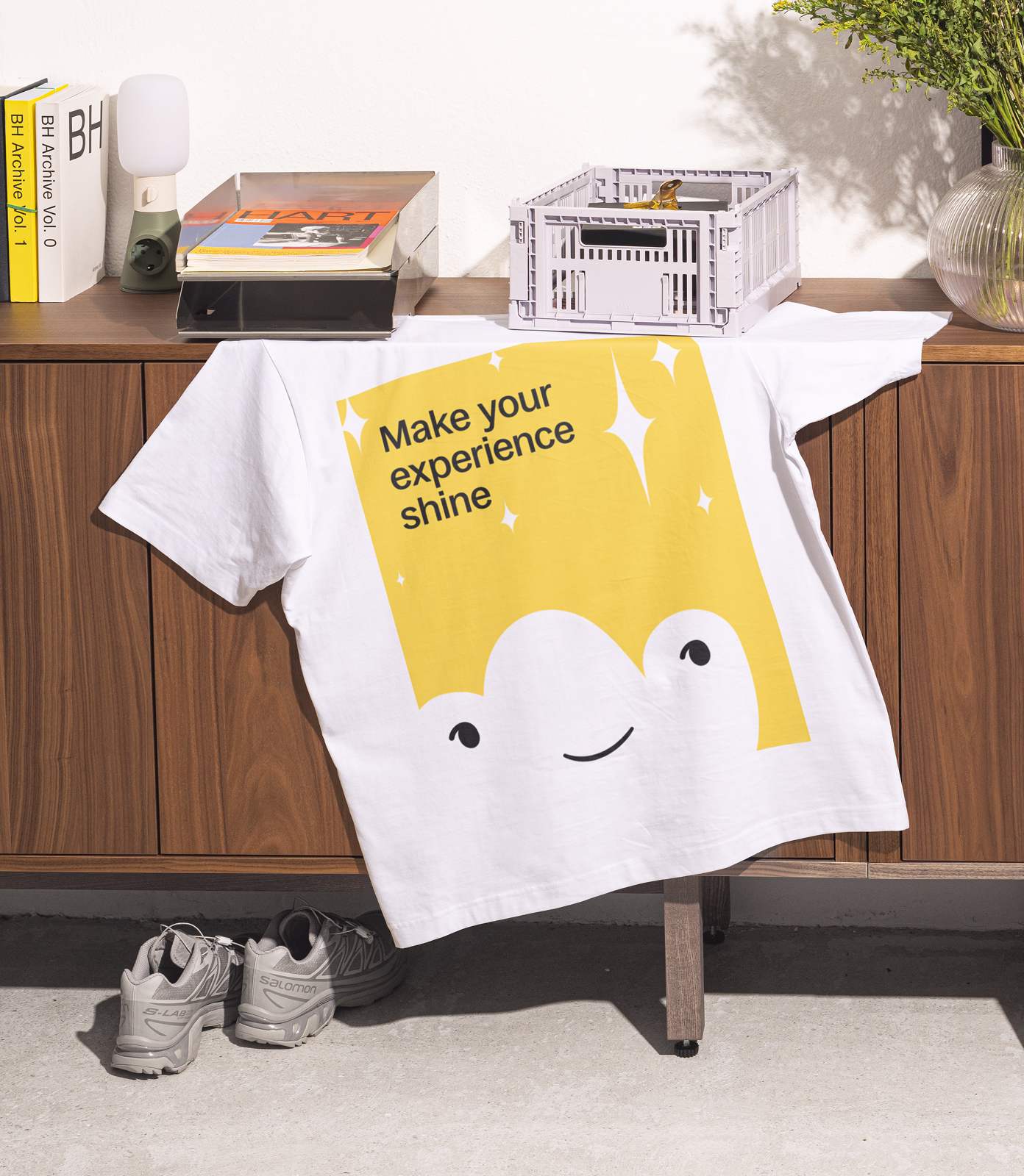
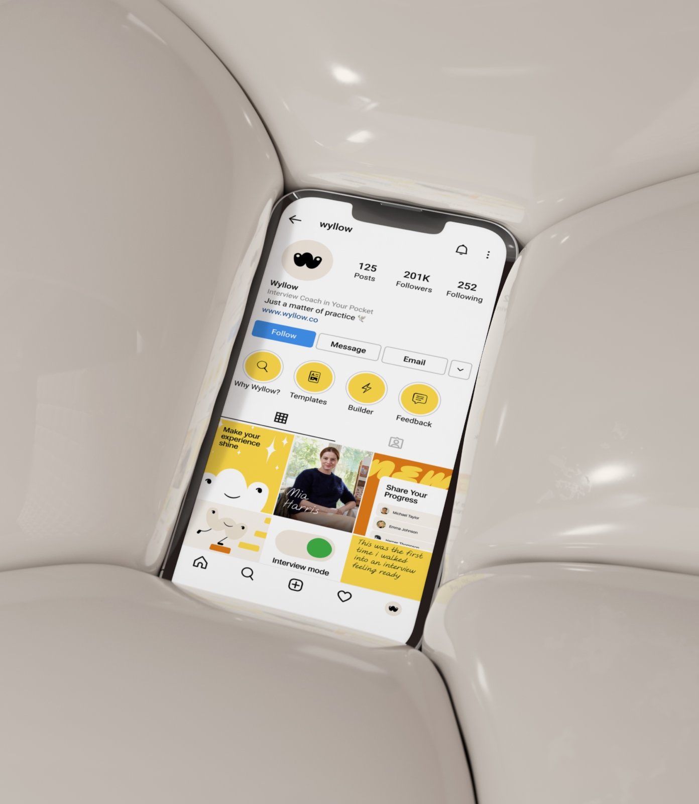
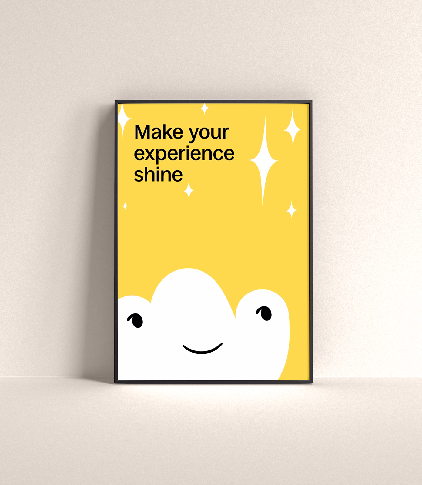
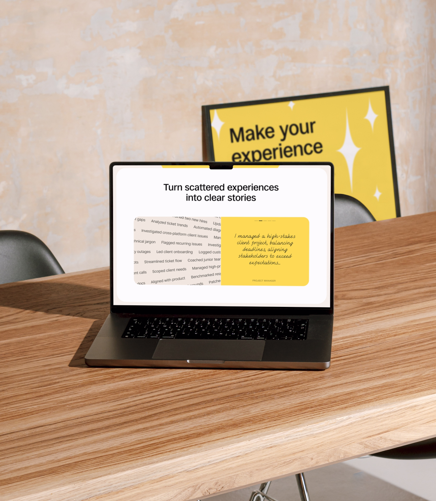
Illustrations are used across the landing page to create a warm atmosphere and support the user emotionally. The Wyllow character and select product elements are rendered in the same style, extending the brand world into every interaction.

Two custom typefaces were designed for Wyllow. Wyllow Script is rough and uneven on purpose, like real handwriting. Every person has a unique story, and the typography reflects that: personal, imperfect, real. Wyllow Brush takes the same energy further for moments where the brand needs to speak louder.

A custom icon set drawn in the same ink-like, handwritten style as the typography. Each icon feels sketched rather than constructed, reinforcing the idea that every voice is unique.


After developing the brand identity, we moved into product design: mapping out interaction logic, defining user scenarios, designing all core screens, and working closely with the founder to shape the product from the ground up.


The website was designed to show what Wyllow actually is: a human, no-stress way to practice interviews and tell your story with confidence. Through motion design and visual storytelling, the site demonstrates how scattered stories become clear ones. Real examples for specific roles walk visitors through what preparation looks like in practice, making the product tangible before they even sign up. Built on Webflow.
Wyllow arrived with a clear conviction: career development should support people, not exploit them. Our role was to give that conviction a visual identity, a voice, and a product experience that could stand apart in a noisy market while staying true to its human-first philosophy across brand, web, and product design.
If you're building a brand that needs to balance warmth with structure, emotional intelligence with commercial clarity, we'd love to help shape it. Reach out at hello@feelystudio.com.
Project team
Design: Tim Lebedev
Webflow: Tim Lebedev
Motion: Liza Tyulina
Art direction: Anastasia Sycheva
Enduvo rebranded to lead a new category in immersive, no-code learning

Bloxspring rebranded to grow from PR shop to global content partner
Southleap built a brand that reframes post-sales hiring as a growth advantage
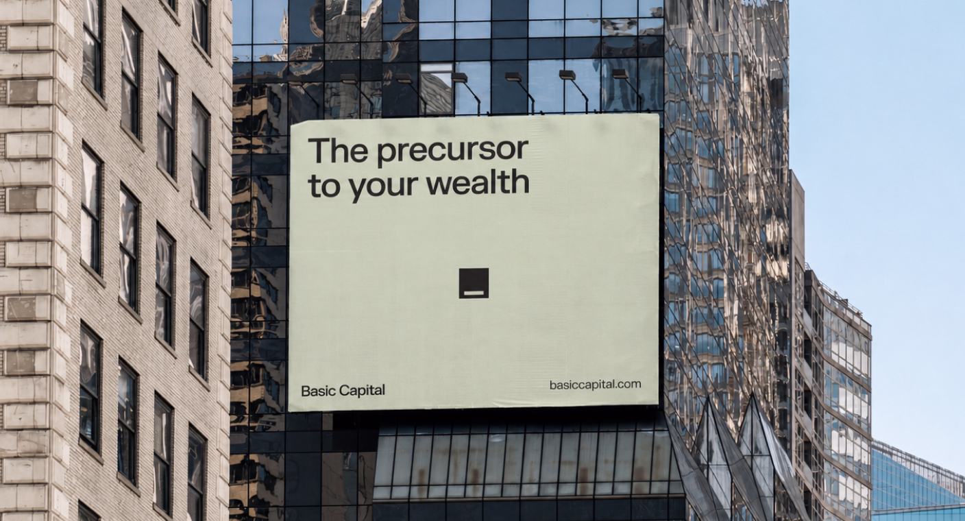
Basic Capital built a trusted brand from day one because in fintech, trust isn’t optional
Aimme showed up bold in B2C HR where bad design kills

Lancer built a brand that signals trust, precision and scale for enterprise clients

Noxus turned vision into $1.5M pre-seed three months after rebrand

Glozo launched bold to get seen by talent and clients in a noisy HR market

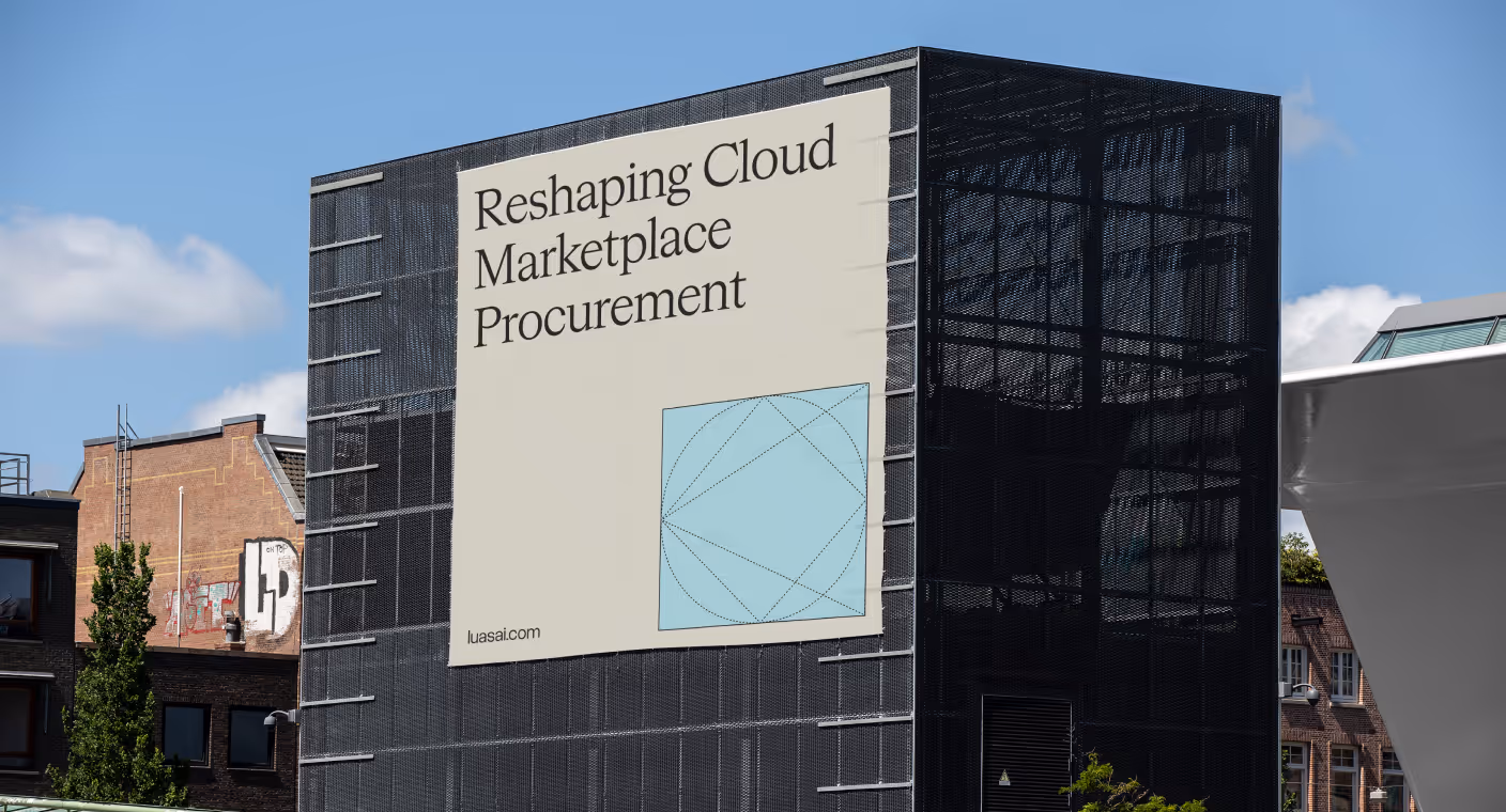
Reshaping Cloud Marketplace Procurement
Design support for Scade, a no-code AI platform for building multi-modal agents

Branding and website for a Swiss web 3.0 startup to bring a new product to market

Redesign project for a healthtech startup

Redesign project for a data startup

Redesign project for a Fintech startup
