

Brand Identity · Web Design · Web development
Southleap is an operator-led talent partner that embeds high-caliber post-sales professionals from Mexico City into growth-stage SaaS companies.
How do you launch a new company in a crowded talent market without sounding like another staffing firm? Southleap entered the market with a strong point of view: growth-stage SaaS companies need customer-facing teams that are cost-efficient, high-performing, and deeply integrated into the business. But most alternatives force a compromise. US hiring is expensive and slow, while traditional outsourcing often weakens quality, trust, and cultural alignment.
Southleap needed a brand that could introduce a different model from day one - one that felt premium, credible, and operator-led. The challenge was not only to explain the offer, but to frame it as a smarter operating advantage rather than a transactional hiring service.
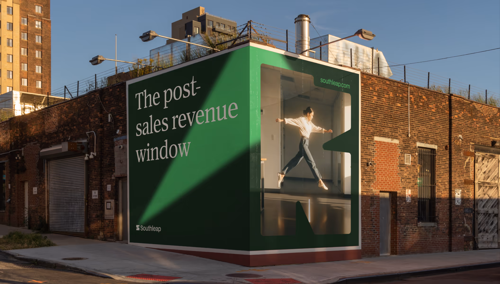


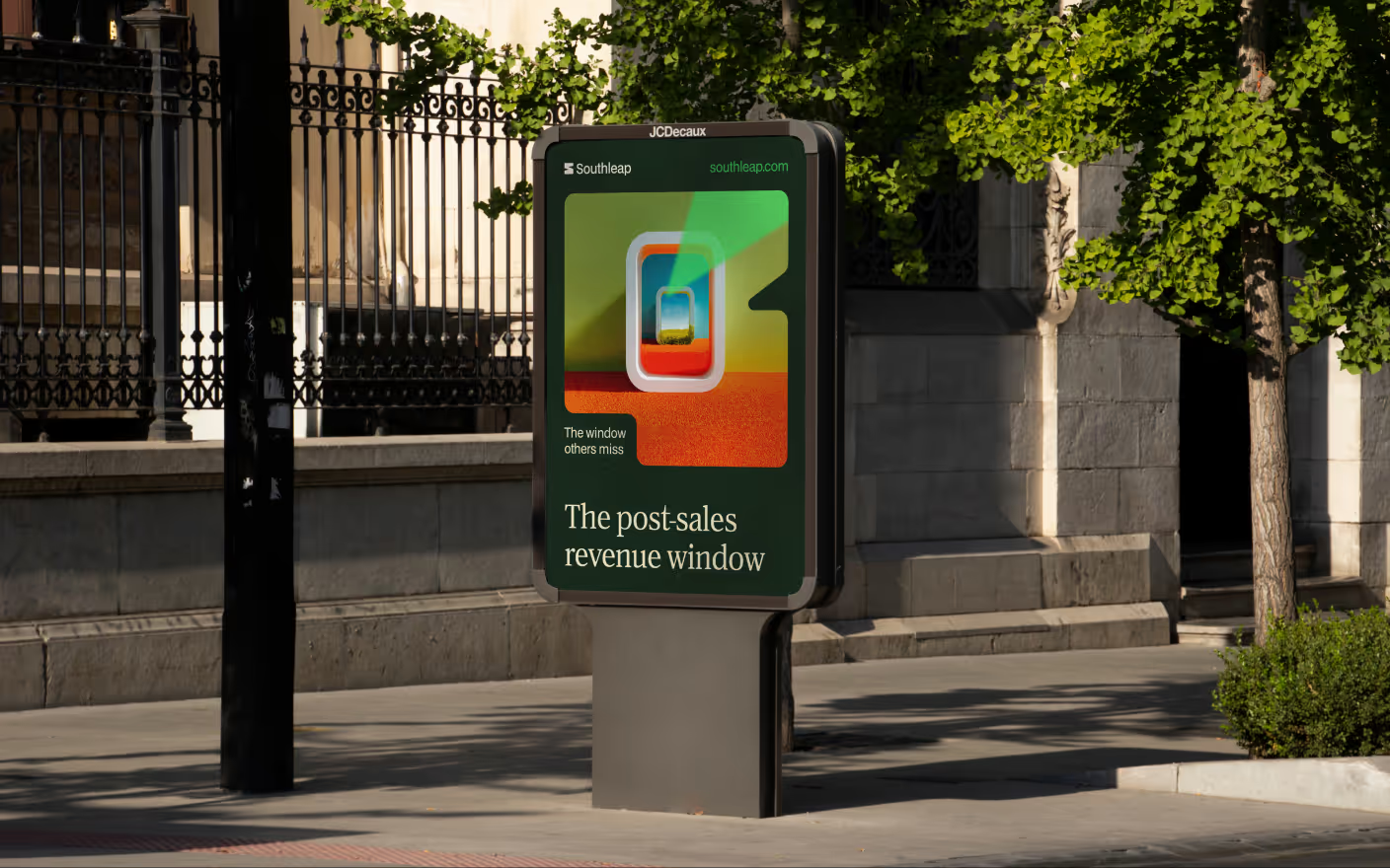
The Growth Window became the central idea. Southleap does not ask companies to choose between cost discipline and team quality; it reveals the overlooked space between them. Framing the business through the metaphor of a window introduced a visual and verbal language of perspective, access, and possibility - a way to communicate that the smartest path to growth was never one of the obvious doors, but the opportunity most companies had failed to see.

The logomark is a stylized “S” that also reads as an open window frame. Its angular geometry and carved negative space create a sense of perspective, movement, and discovery - the visual expression of opening onto a smarter talent horizon. Paired with a refined wordmark, the identity feels premium, modern, and operator-led. A system of primary and vertical lockups ensures clarity across touchpoints.
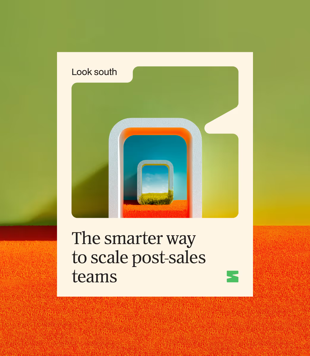
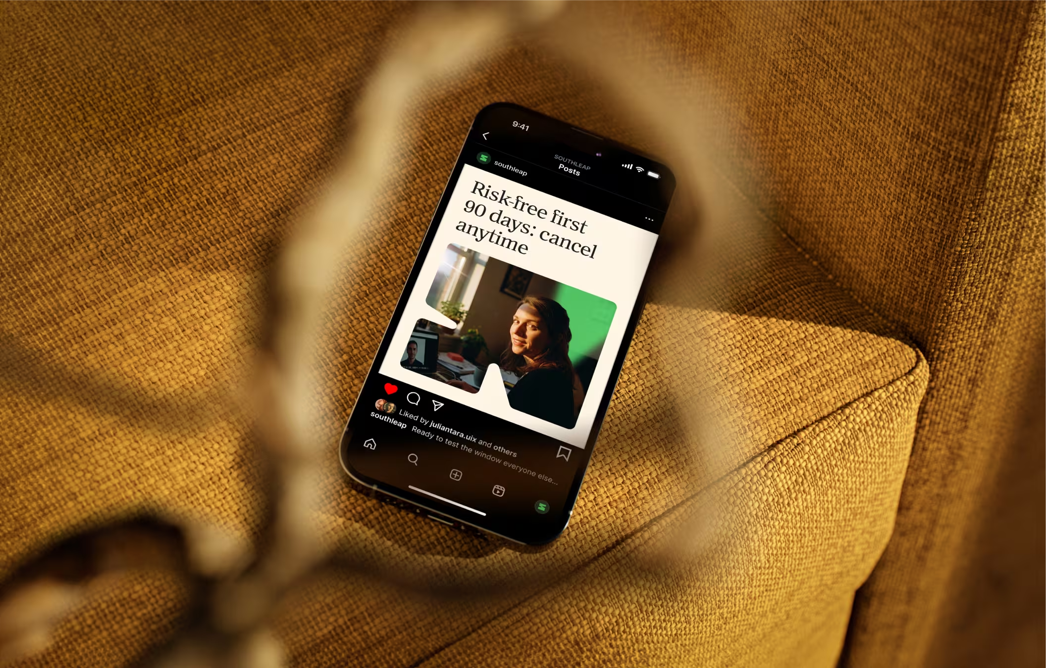
The visual language grows from the idea of the Growth Window. Framed compositions, angular cuts, light rays, and directional geometry create a sense of perspective, movement, and opening onto new possibilities. Window-shaped masks and layered crops turn the metaphor into a flexible system across digital and brand applications, while the restrained palette and clean structure keep the identity feeling premium, modern, and commercially sharp.
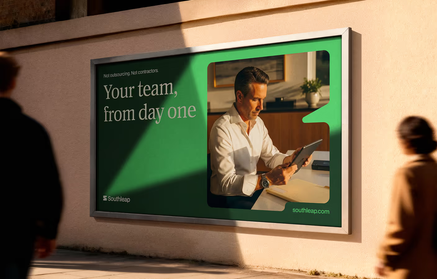
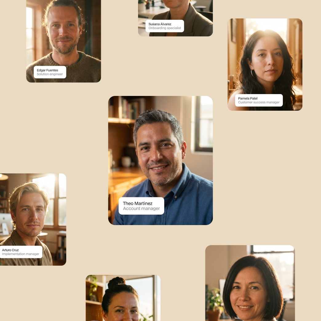

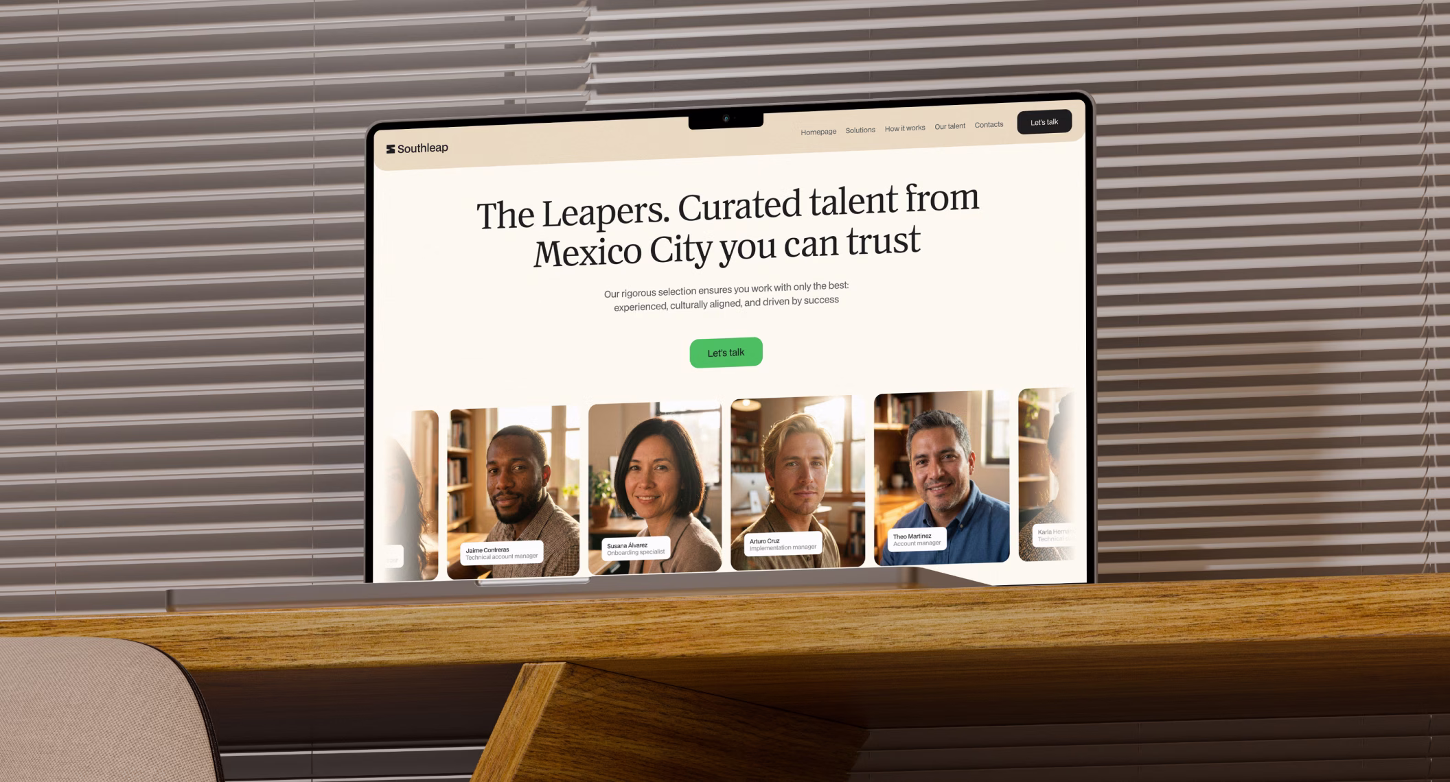
Warm, golden-hour photography gives the brand a more human and credible presence. Natural light, subtle expressions, and modern Mexico City environments make premium talent feel approachable, real, and embedded. Rather than relying on generic corporate imagery, the visual direction creates a calm editorial atmosphere that conveys trust, sophistication, and the lived reality of operators at work.
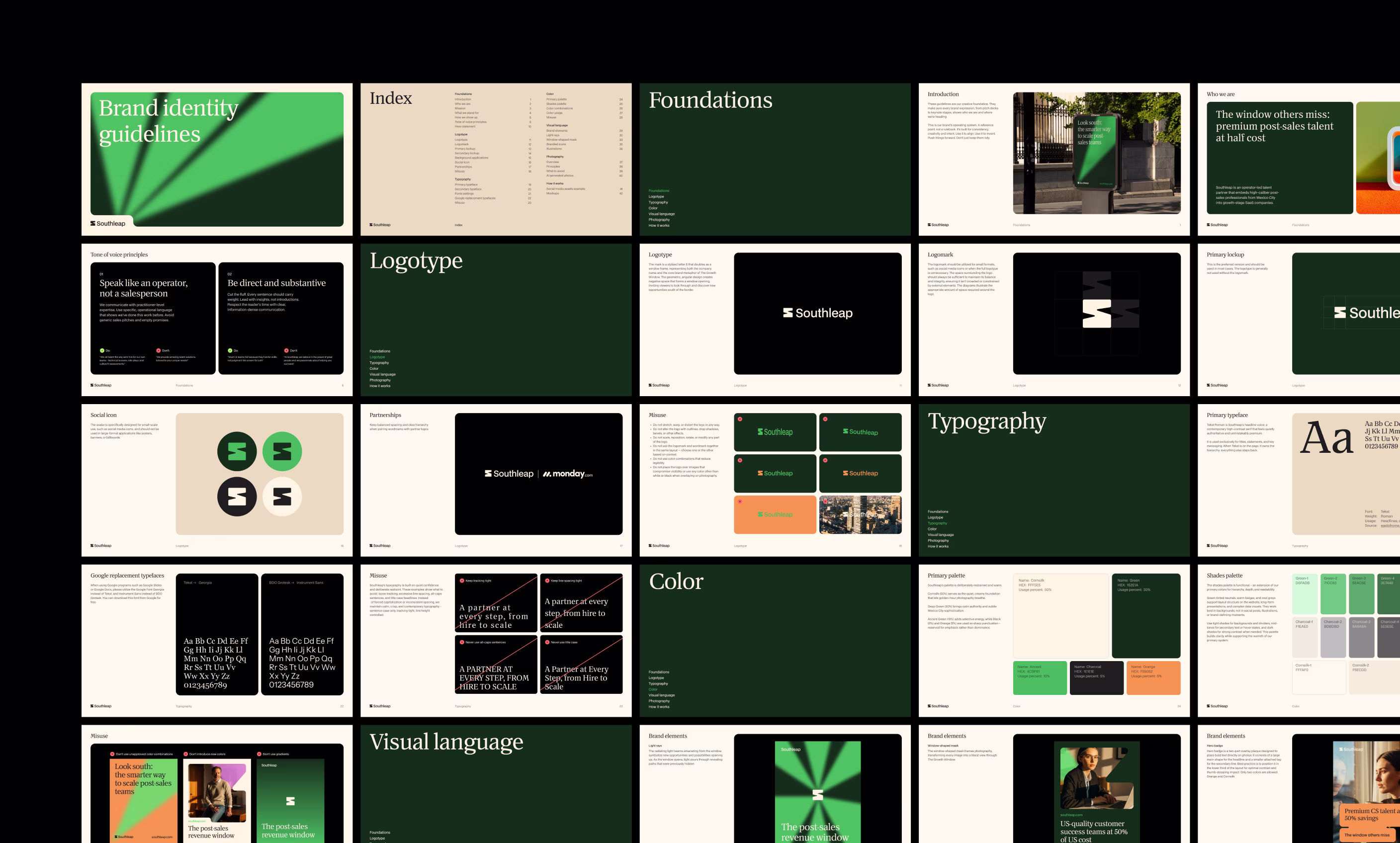
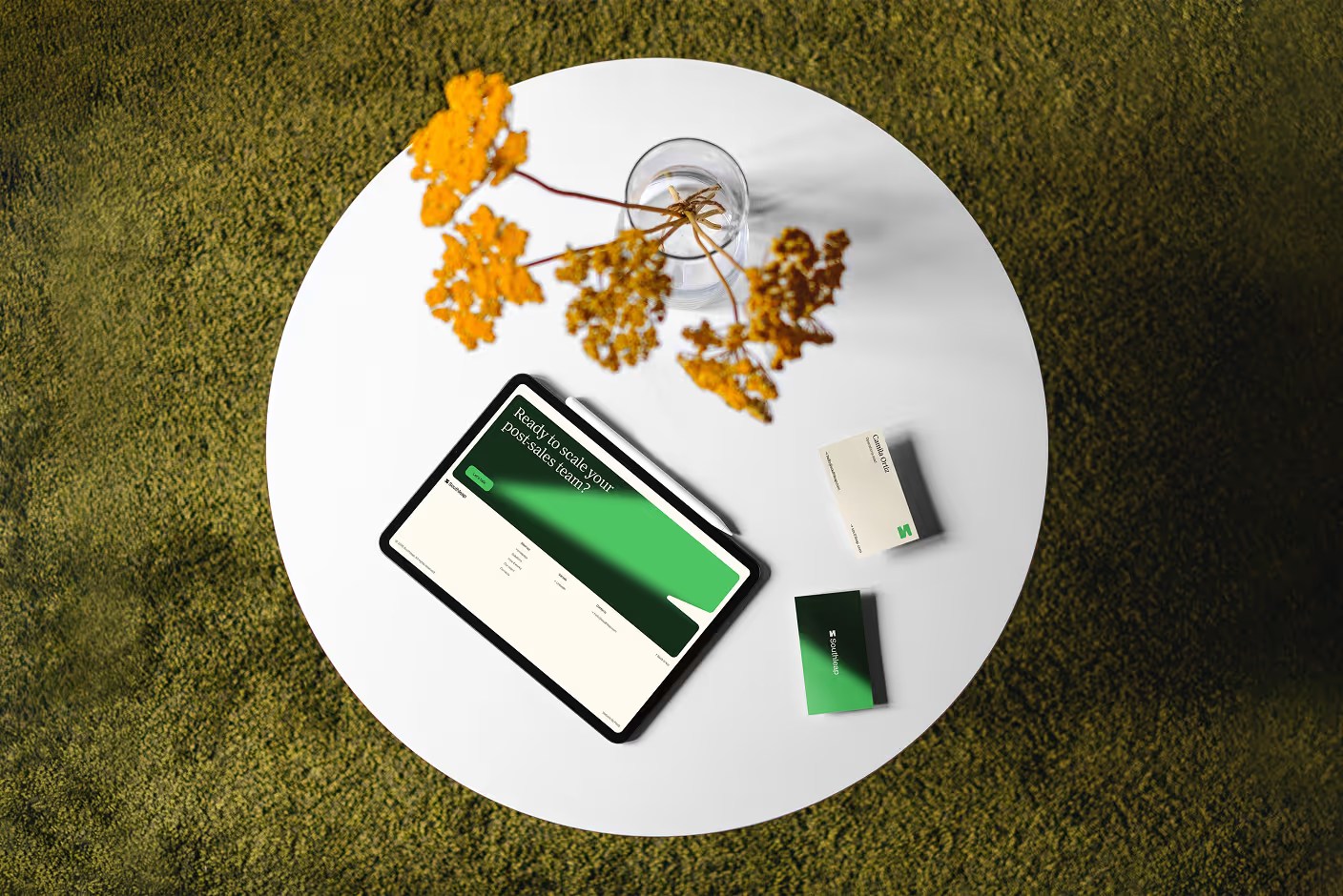
The brand guidelines were developed as Southleap’s operating system: a clear framework for how the identity behaves across touchpoints. From typography and color discipline to composition, masking, and hierarchy, the system keeps the brand consistent, elevated, and commercially sharp as it scales.


A custom icon set built on a strict 64x64 grid extends the geometry of the window into a more functional storytelling layer. Bold forms and crisp angles communicate structure, efficiency, and operational discipline, while helping translate themes like cost efficiency, integration, skills, fluency, and growth into immediate signals.

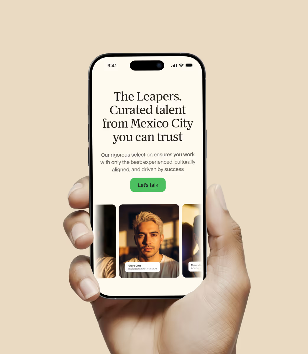
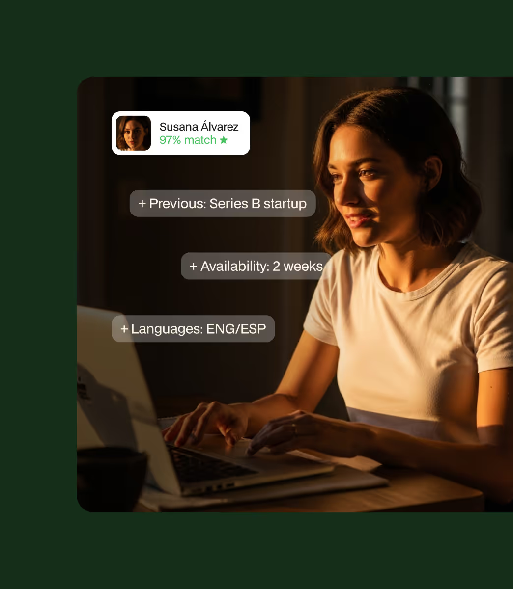
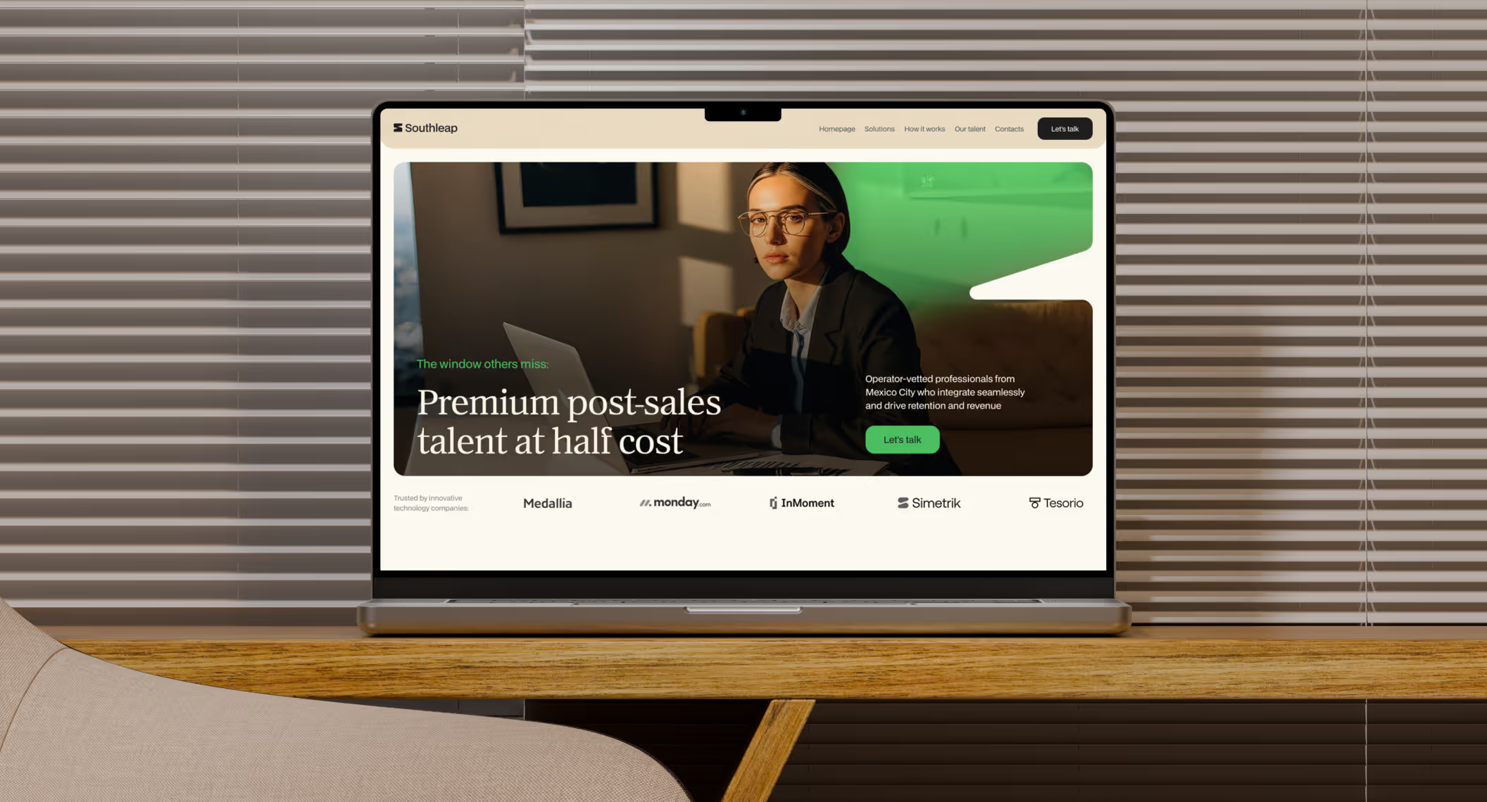
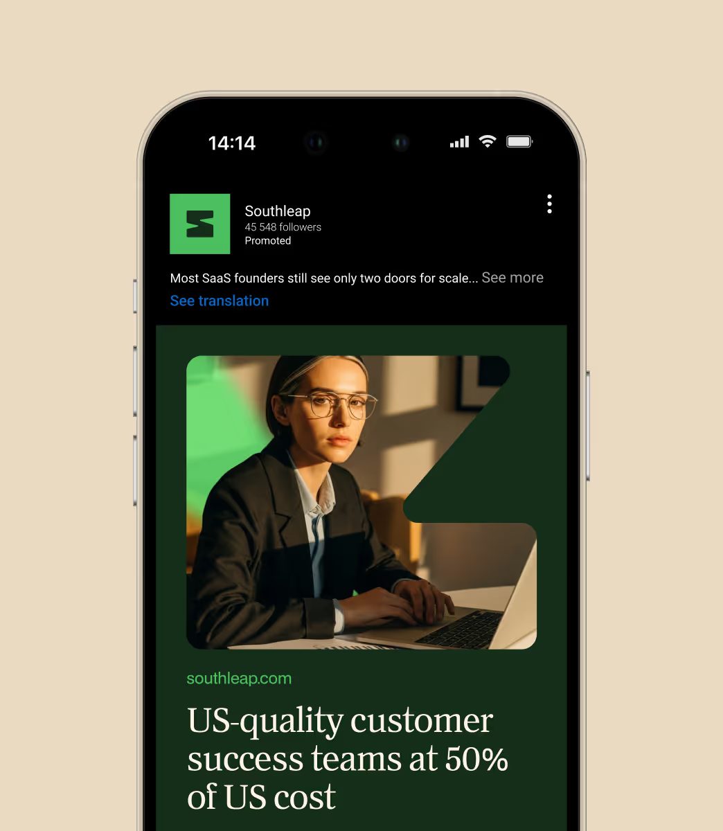
The website translates the Growth Window into a digital experience through directional light, framed compositions, warm photography, and clear operator-led messaging. Structured to communicate the model with speed and precision, it positions Southleap as a premium, operator-led partner rather than a conventional staffing brand. The result is a presence that feels modern, distinctive, and commercially clear.
The presentation system extends the identity into decks designed for real business conversations. Clean typography, disciplined spacing, and window-based compositions create a format that feels sharp, polished, and persuasive. Built for founder conversations, GTM materials, and strategic storytelling, the template helps Southleap show up as a thoughtful operating partner rather than a transactional staffing provider.
Southleap came with a strong point of view from the start, shaped by people who understand customer-facing teams from the inside. Our role was to sharpen that perspective into a brand system with enough clarity, warmth, and structure to support growth across web, sales, and internal materials.
If you’re building a brand that needs strategic clarity, a strong point of view, and a system designed to scale, we’d love to help shape it. Reach out at hello@feelystudio.com.
Design & webflow development: Tatiana Leonteva
Client: Southleap
Office: Los Angeles
Discipline
Brand Identity
Web Design
Webflow
Project team
Art direction: Anastasia Sycheva
Design: Tatiana Leonteva
Webflow: Tatiana Leontieva
Enduvo rebranded to lead a new category in immersive, no-code learning

Wyllow created a human-first brand for high-stakes career moments

Bloxspring rebranded to grow from PR shop to global content partner
Basic Capital built a trusted brand from day one because in fintech, trust isn’t optional
Lancer built a brand that signals trust, precision and scale for enterprise clients

Noxus turned vision into $1.5M pre-seed three months after rebrand

Glozo launched bold to get seen by talent and clients in a noisy HR market

Reshaping Cloud Marketplace Procurement
Aimme showed up bold in B2C HR where bad design kills

Branding and website for a Swiss web 3.0 startup to bring a new product to market

Design support for Scade, a no-code AI platform for building multi-modal agents

Visual identity and website design for a healthcare data management company

Redesign project for a healthtech startup

Redesign project for a data startup

Redesign project for a Fintech startup
