Brand Identity · Web Design · Web Development
Nerra Group is a capital strategy advisory helping capital seekers and long-term investors navigate positioning, relationships, and cross-border engagement with greater clarity.
Capital advisory depends on trust, clarity, and strong relationships across markets. Nerra Group needed an identity that could turn these intangible qualities into a distinctive and credible brand.
The system speaks to family offices, institutional investors, founders, and funds with equal confidence. One clear visual language expresses global perspective, cultural fluency, and thoughtful capital movement.
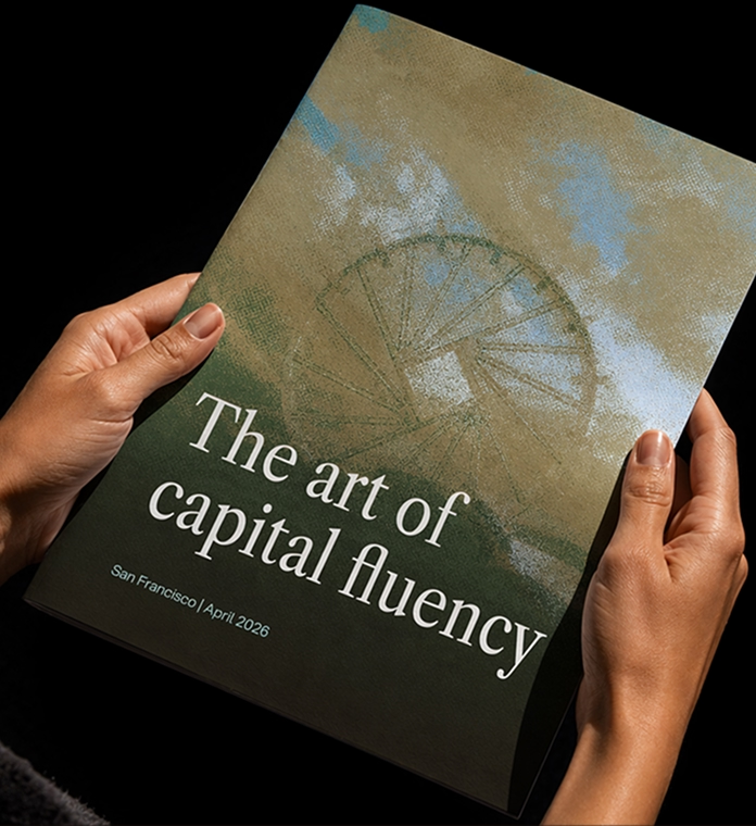
At the heart of Nerra Group’s identity is the noria — an ancient water-lifting wheel used across the Middle East and Mediterranean to carry water continuously from source to destination. This metaphor reflects how capital moves through systems shaped by clarity, timing, cultural understanding, and trust.
“We architect flow” connects Nerra Group’s strategic role with a visual language of rivers, currents, and continuous movement across markets.
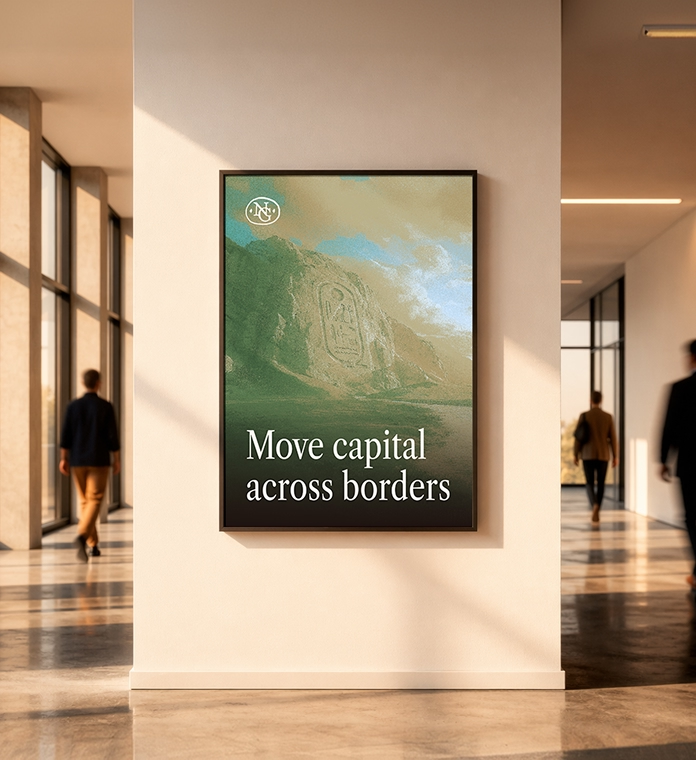
The wordmark uses an elegant serif typeface to convey authority, discretion, and the quiet confidence expected in high-trust financial relationships. An interlocking N and G monogram forms a compact seal, referencing both the circular movement of the noria and the visual language of established institutions. Its slightly imperfect contour keeps the identity human and prevents the brand from feeling rigid or overly corporate. Together, the wordmark and monogram balance heritage with a contemporary point of view.
.avif)

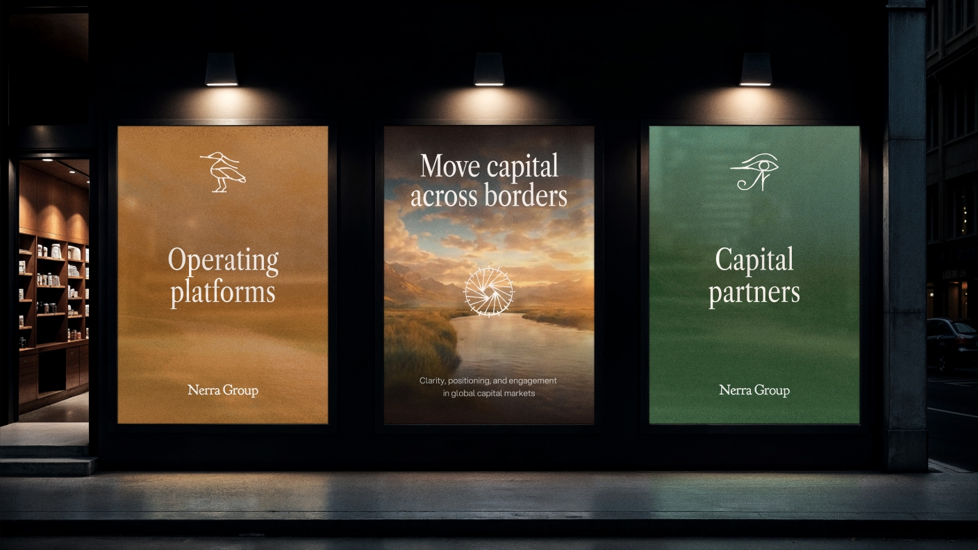
The visual language turns capital flow into the movement of water. Rivers, currents, and expansive landscapes suggest continuous passage across regions, while warm natural light creates a sense of perspective and calm. A custom dithering effect, inspired by banknote printing, gives the imagery a tactile, archival quality. Deep brown replaces pure black, paired with sand and muted green to create a cinematic, golden-hour atmosphere.
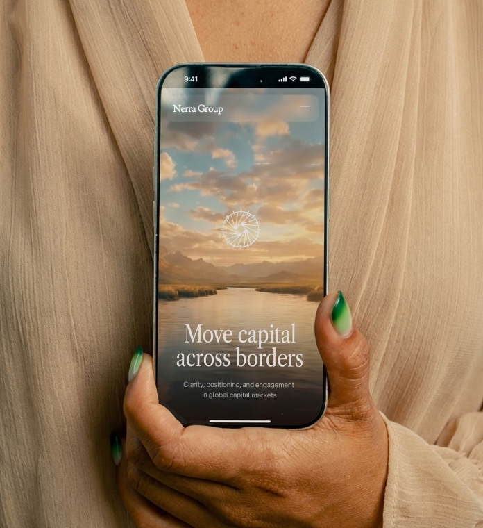
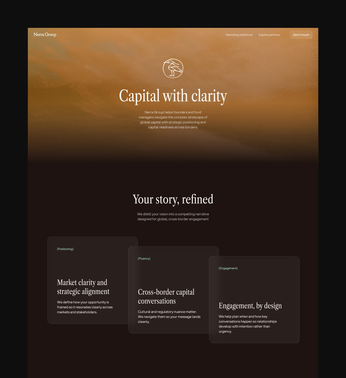
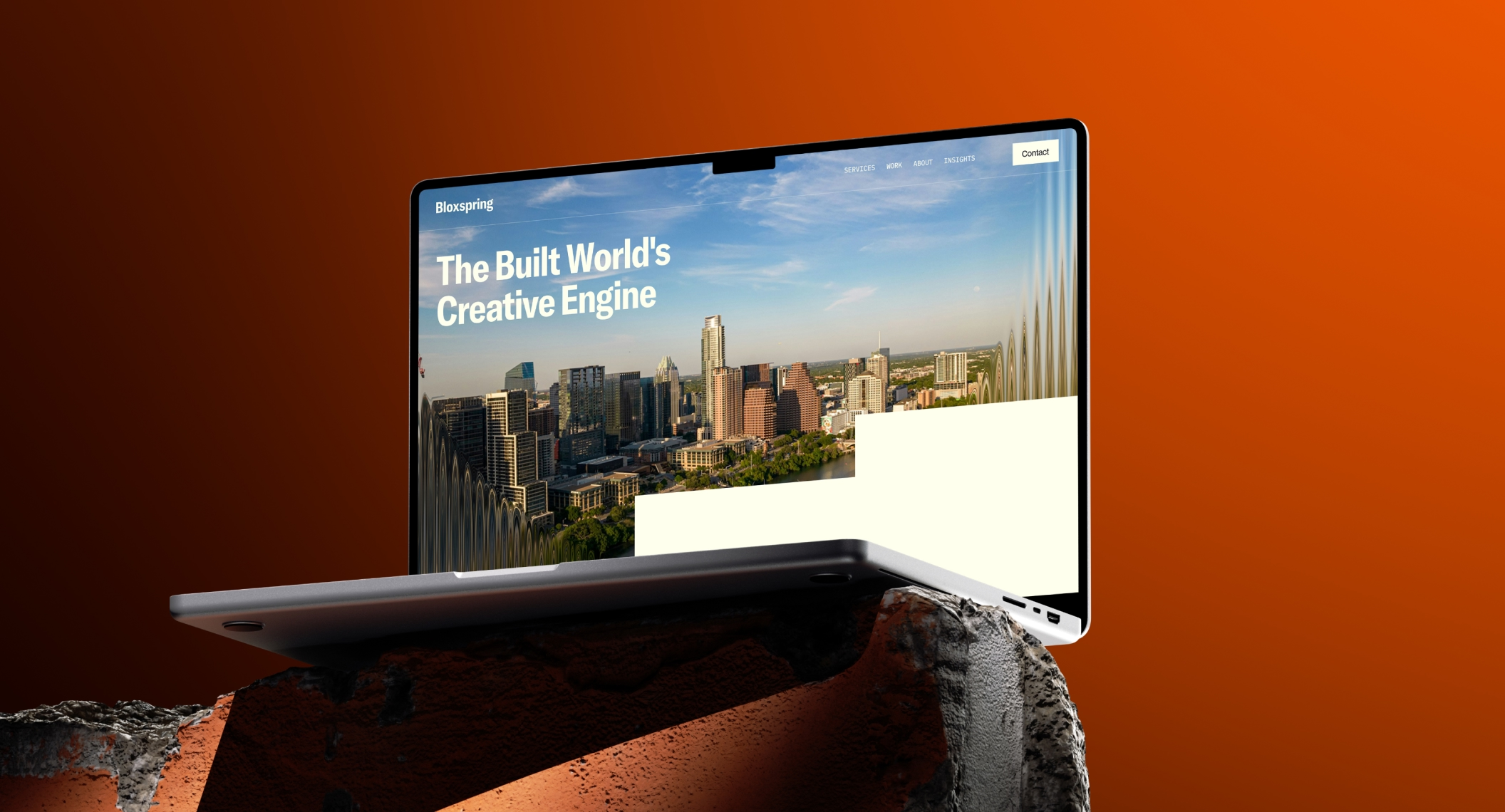
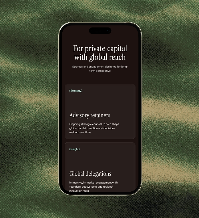
The website transforms the brand metaphor into an experience. Water imagery, flowing compositions, and considered transitions guide visitors through the content with a sense of continuous movement. A clear structure helps capital seekers and allocators understand Nerra's role, while editorial typography and layered imagery bring authority, warmth, and perspective.

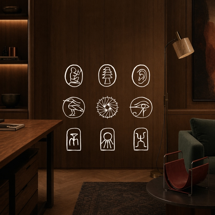
The icon system draws from the character of ancient cuneiform and early symbolic writing. Each hand-drawn mark is enclosed within a simple form, giving it the quality of a discovered sign or institutional seal. This historical reference connects the identity to the origins of the noria while reinforcing continuity, knowledge, and trust.
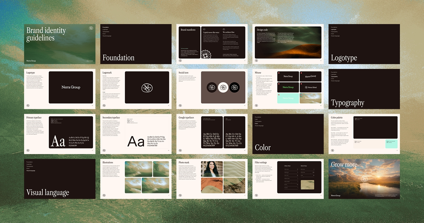
We developed practical guidelines covering the wordmark, monogram, typography, colour, iconography, photography, image masks, and custom filter settings. The system gives Nerra Group the flexibility to create new digital and printed materials while preserving a consistent and recognisable visual atmosphere.
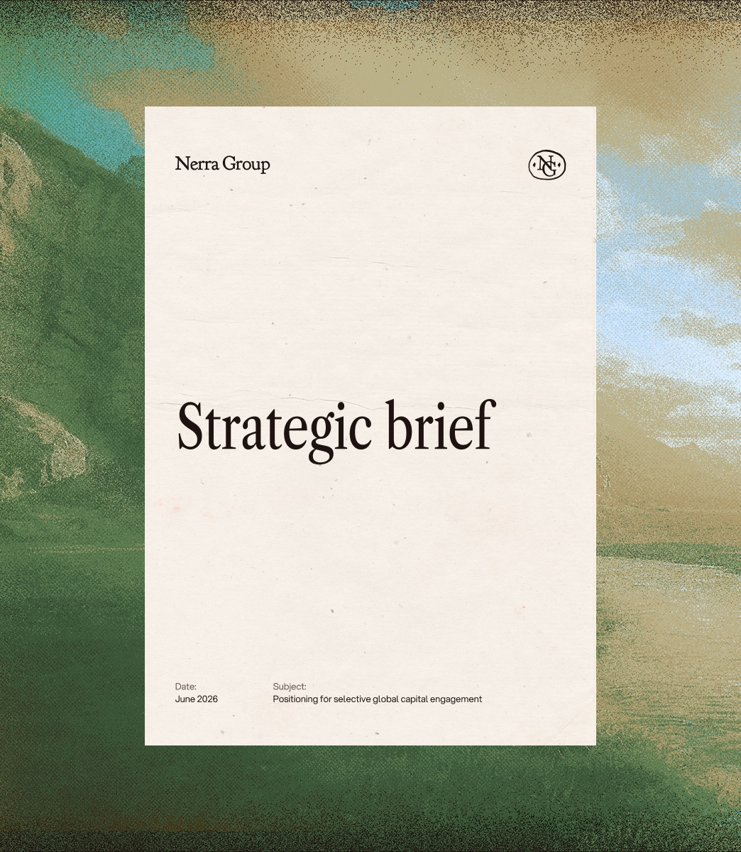

The result is a brand built around one coherent idea: capital as a flow that can be shaped with clarity and intent. Ancient symbolism, contemporary editorial design, tactile image treatments, and fluid digital motion come together in an identity that feels established without being conventional.
The system gives Nerra Group a distinctive presence across its website, presentations, strategic documents, and communications, reflecting the same qualities it brings to capital relationships: perspective, discretion, and thoughtful structure.
Discipline
Brand Identity
Web Design
Framer Development
Project team
Strategy and copy: Natalia Dianov
Design: Tatiana Leontieva
Art direction: Anastasia Sycheva